

Summary
Learning How to Make Images Load Faster is one of the most effective ways to improve website speed, user experience, Core Web Vitals, and SEO performance. Large, uncompressed, or poorly formatted images can slow down pages, increase bounce rates, and make visitors leave before your content even appears. The good news is that image optimization does not require advanced technical skills. By choosing the right image format, compressing files, resizing dimensions, using lazy loading, enabling browser caching, and serving images through a CDN, you can make your website feel faster and more professional.
This guide explains practical, beginner-friendly, and SEO-focused methods to reduce image load time without ruining visual quality. Whether you run a blog, ecommerce store, portfolio, business website, or landing page, these steps will help your images load quickly on desktop and mobile devices.
Table of Content
- What Makes Website Images Load Slowly?
- How to Make Images Load Faster with the Right Format
- How to Make Images Load Faster Without Losing Quality
- Resize Images Before Uploading
- Compress Images for Better Page Speed
- Use Lazy Loading for Below-the-Fold Images
- Serve Responsive Images for Mobile and Desktop
- Use a CDN to Deliver Images Faster
- Enable Browser Caching for Images
- Optimize Image SEO Alongside Speed
- Common Image Optimization Mistakes
- Conclusion
- FAQs
What Makes Website Images Load Slowly?
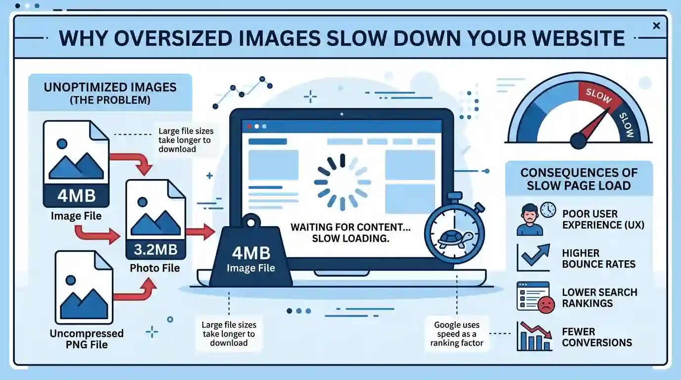
Images often take up the largest portion of a web page’s total weight. A single unoptimized banner, product photo, or blog image can be several megabytes in size. When multiple heavy images load together, the browser needs more time to download, decode, and display them.
Slow image loading usually happens because of:
- Oversized image dimensions
- Large file sizes
- Wrong image file format
- No compression
- Too many images above the fold
- Missing lazy loading
- Poor hosting performance
- No content delivery network
- Images not optimized for mobile screens
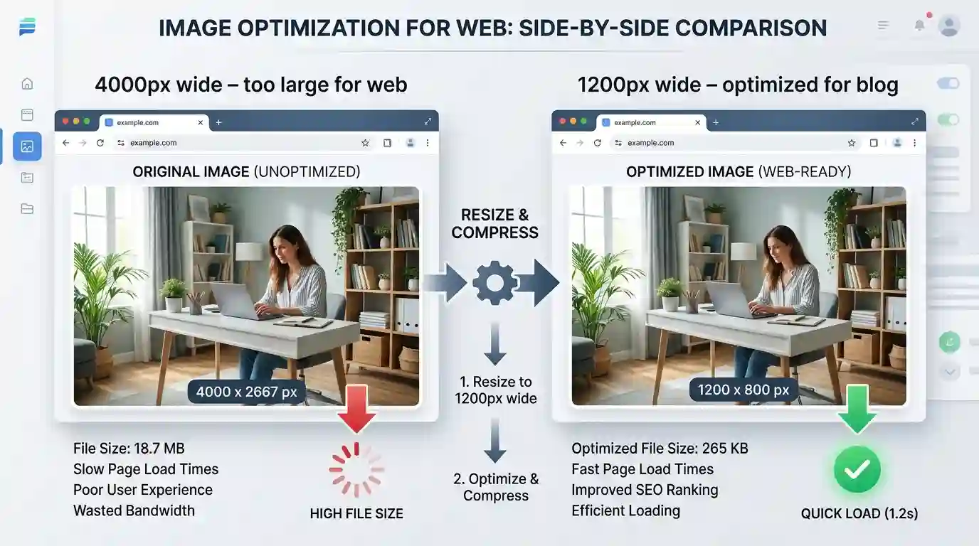
For example, uploading a 4000px wide photo when your blog content area only displays 800px is a waste of bandwidth. The browser still downloads the large file even though users only see a smaller version.
Image speed matters because it affects Largest Contentful Paint, page load time, mobile performance, user engagement, and search engine rankings. Faster images help visitors access your content quickly and make your website feel smoother.
How to Make Images Load Faster with the Right Format
Choosing the right image format is one of the easiest ways to reduce image file size. Different formats are designed for different purposes, and using the wrong format can make your images unnecessarily heavy.
Use JPG for Photos
JPG, also known as JPEG, is best for photographs, blog images, product photos, travel pictures, food images, and realistic visuals with many colors. JPG files are usually much smaller than PNG files, which makes them ideal for web pages.
If you have a PNG photo that does not need transparency, converting it to JPG can significantly reduce file size. You can use the Convert PNG to JPG Free Tool to quickly change PNG images into a lighter JPG format.
Use PNG for Transparency and Graphics
PNG is useful when you need transparent backgrounds, sharp logos, icons, screenshots, or graphics with text. However, PNG files are often larger than JPG files, especially for detailed images.
Use PNG only when transparency or high-detail graphics are required. For normal blog photos, JPG or WebP is usually better.
Use WebP for Modern Image Optimization
WebP is a modern image format that offers strong compression while keeping good visual quality. It can support both lossy and lossless compression, making it useful for photos, illustrations, and web graphics.
Many modern websites use WebP because it helps reduce page weight and improve loading speed. According to Google’s web.dev image optimization guidance, choosing efficient image formats and compression methods can improve loading performance and user experience. You can read more from the authoritative guide on image optimization by web.dev.
Use SVG for Logos and Simple Icons
SVG is best for simple graphics, logos, shapes, and icons. Unlike JPG or PNG, SVG is vector-based, meaning it can scale without losing quality. SVG files are often very small and look sharp on all screen sizes.
However, SVG is not suitable for complex photos.
How to Make Images Load Faster Without Losing Quality
Many website owners worry that optimizing images will make them blurry or unattractive. The goal is not to destroy image quality. The goal is to remove unnecessary data and serve images at the correct size.
Balance Quality and File Size
A high-quality image does not always need to be saved at 100% quality. In many cases, a JPG saved at 70% to 85% quality looks almost identical to the original but has a much smaller file size.
For blog posts, tutorials, product images, and featured images, this balance is important. You want visuals to look professional while still loading quickly.
Avoid Over-Compression
Compressing images too much can create visible problems such as:
- Blurry details
- Pixelation
- Color banding
- Rough edges
- Distorted text in screenshots
Always preview compressed images before publishing. The best image optimization workflow keeps images clear enough for users while reducing file size as much as possible.
Use the Correct Image Dimensions
Image quality is not only about compression. It is also about dimensions. If your article image displays at 1200px wide, you do not need to upload a 5000px wide image. Oversized dimensions increase file size without improving the user’s viewing experience.
You can also read this helpful guide on Best Dimensions for Blog Images to choose proper image sizes for blog posts, thumbnails, and featured images.
Resize Images Before Uploading
One of the biggest image optimization mistakes is uploading images directly from a camera, phone, or design tool without resizing them first.
Modern smartphones can capture images that are 3000px to 6000px wide. These images are excellent for printing, but they are usually too large for websites.
Recommended Image Dimensions
For most websites, these dimensions work well:
- Blog content images: 800px to 1200px wide
- Featured blog images: 1200px to 1600px wide
- Product images: 800px to 1200px wide
- Thumbnails: 300px to 600px wide
- Hero banners: 1600px to 1920px wide
The exact size depends on your website layout, theme, and design. The key rule is simple: do not upload images much larger than the space where they will appear.
Why Resizing Improves Speed
Resizing reduces the total number of pixels in an image. Fewer pixels mean a smaller file size. Smaller files download faster, especially on mobile networks.
For example, a 4000px wide image may be several megabytes. After resizing it to 1200px wide and compressing it, the same image may become only a few hundred kilobytes.
Compress Images for Better Page Speed
Image compression reduces file size by removing unnecessary data. It is one of the most important steps when learning how to make images load faster.
Lossy Compression
Lossy compression reduces file size by permanently removing some image data. It is commonly used for JPG and WebP images. When done properly, the visual difference is very small, but the file size can become much lighter.
Lossy compression is best for:
- Blog photos
- Product photos
- Travel images
- Food images
- Lifestyle images
- Background images
Lossless Compression
Lossless compression reduces file size without removing visible image data. It is often used for PNG files, icons, logos, and screenshots.
Lossless compression is best for:
- Logos
- Icons
- Graphics with text
- Screenshots
- Transparent images
Ideal Image File Size
There is no single perfect file size, but these are useful targets:
- Small icons: under 50 KB
- Blog images: under 150 KB to 300 KB when possible
- Featured images: under 300 KB to 500 KB when possible
- Hero images: under 500 KB to 1 MB if needed
The lighter your images are, the faster your page can load.
Use Lazy Loading for Below-the-Fold Images
Lazy loading means images only load when users are about to see them. Instead of loading every image at once, the browser waits until the visitor scrolls near the image.
This is especially useful for long blog posts, galleries, ecommerce category pages, tutorials, and landing pages with many visuals.
Why Lazy Loading Works
When a page first opens, users usually see only the top section. Images lower down the page do not need to load immediately. Lazy loading reduces initial page weight and helps the main content appear faster.
Native Lazy Loading
Modern browsers support native lazy loading with the loading attribute:
loading=”lazy”
This tells the browser to delay loading the image until it is needed. Many content management systems and website builders now apply lazy loading automatically.
Avoid Lazy Loading Critical Images
Do not lazy load important above-the-fold images such as:
- Hero images
- Featured images visible at the top
- Logo images
- First product image
- Main banner image
These images should load quickly because they are part of the first visible screen.
Serve Responsive Images for Mobile and Desktop
A desktop visitor may need a larger image, while a mobile visitor needs a smaller version. Responsive images allow the browser to choose the best image size based on the user’s screen.
Why Responsive Images Matter
Without responsive images, a mobile user may download the same large image intended for desktop screens. This wastes mobile data and slows down loading.
Responsive images improve:
- Mobile page speed
- User experience
- Bandwidth usage
- Core Web Vitals
- SEO performance
Use Multiple Image Sizes
A good image workflow includes several sizes, such as:
- 400px for small mobile screens
- 800px for tablets
- 1200px for blog content
- 1600px or more for large banners
The browser can then serve the most suitable version.
Use Srcset
The srcset attribute allows you to provide multiple image versions. The browser automatically selects the right one based on device size and display resolution.
This is helpful for retina screens, mobile optimization, and responsive web design.

Use a CDN to Deliver Images Faster
A content delivery network, or CDN, stores copies of your images on servers around the world. When someone visits your website, images are delivered from a server closer to their location.
How a CDN Improves Image Loading
If your website server is located in one country and a visitor is in another, image files may take longer to travel. A CDN reduces this distance and improves loading speed.
A CDN can help with:
- Faster global delivery
- Reduced server load
- Better reliability
- Improved mobile performance
- Faster image-heavy pages
CDN Image Optimization Features
Some CDNs also offer automatic image optimization, including:
- Format conversion
- WebP delivery
- Image resizing
- Compression
- Caching
- Adaptive quality
This can save time because images are optimized automatically based on the visitor’s browser and device.
Enable Browser Caching for Images
Browser caching allows repeat visitors to load images faster. When someone visits your page, their browser can store certain image files locally. On the next visit, the browser does not need to download the same images again.
Why Caching Helps
Caching is useful for repeated assets such as:
- Logos
- Icons
- Background images
- Product images
- Website banners
- UI graphics
When these files are cached, pages feel faster for returning visitors.
Set Long Cache Expiration for Static Images
Static images that do not change often can use longer cache expiration times. This tells the browser to keep them for days, weeks, or even months.
However, when updating an image, you may need to change the filename or version number so the browser loads the new version.
Optimize Image SEO Alongside Speed
Image optimization is not only about speed. It also supports better search visibility. Search engines use image context, filenames, alt text, page content, and structured information to understand visuals.
Use Descriptive File Names
Before uploading an image, rename it with meaningful keywords. Avoid generic names like:
IMG_5482.jpg
Use descriptive names like:
fast-loading-blog-image-example.jpg
This helps search engines and users understand the image topic.
Write Helpful Alt Text
Alt text describes an image for screen readers and search engines. It should be clear, natural, and useful.
Good alt text example:
“Comparison of a large uncompressed image and a smaller optimized image for faster website loading.”
Avoid keyword stuffing. Do not repeat the primary keyword in every image alt tag. Keep it relevant to the image.
Add Captions When Useful
Captions can help readers understand important visuals. They also add context around the image, which can support SEO.
Use captions for:
- Charts
- Tutorials
- Comparisons
- Infographics
- Step-by-step visuals
- Product examples
Keep Images Relevant to the Content
Every image should support the article. Random stock photos may look nice, but they do not always help readers. Use images that explain a concept, show a process, or improve understanding.
Common Image Optimization Mistakes
Even small mistakes can slow down your website. Avoid these common image performance problems.
Uploading Huge Original Images
Do not upload full-resolution camera images unless the website truly needs them. Resize first, then compress.
Using PNG for Every Image
PNG is useful, but it is not always the best choice. Photos should usually be JPG or WebP.
Ignoring Mobile Users
Mobile users often have slower connections and smaller screens. Always optimize images for mobile devices.
Forgetting Featured Images
Featured images are often loaded near the top of blog posts. If they are too large, they can hurt Largest Contentful Paint and slow the first impression.
Adding Too Many Images Above the Fold
The first screen should be lightweight. Avoid placing multiple large images before the main content loads.
Not Testing Page Speed
After optimizing images, test your page speed using tools like PageSpeed Insights, Lighthouse, or GTmetrix. These tools can show whether images are properly sized, compressed, and delivered efficiently.
Conclusion
Knowing how to make images load faster is essential for any website that wants better speed, stronger SEO, and a smoother user experience. Images make content more engaging, but they should never slow down your pages.
Start with the basics: choose the right format, resize images before uploading, compress files, and avoid oversized dimensions. Then improve performance further with lazy loading, responsive images, browser caching, and CDN delivery.
The best approach is to create a repeatable image optimization workflow. Before publishing any image, ask yourself: Is this the right format? Is the file size small enough? Are the dimensions correct? Is the image useful for readers? Does it support SEO?
When your images are lightweight, properly formatted, and delivered efficiently, your website loads faster, visitors stay longer, and search engines can better understand your content.
FAQs
1. What is the best image format for faster loading?
JPG is great for photos, PNG is useful for transparent graphics, SVG is best for icons and logos, and WebP is one of the best modern formats for fast-loading web images.
2. How do I make images load faster on my website?
You can make images load faster by resizing them, compressing them, using the correct format, enabling lazy loading, serving responsive images, using a CDN, and enabling browser caching.
3. Does image size affect SEO?
Yes. Large image files can slow down your website, which can affect user experience and Core Web Vitals. Faster pages are generally better for SEO and visitor engagement.
4. Should I use PNG or JPG for blog images?
For most blog photos, JPG is better because it usually creates smaller files. PNG should be used when you need transparency, screenshots, logos, or sharp graphics.
5. What is lazy loading for images?
Lazy loading delays image loading until the user scrolls near the image. This reduces the initial page load and helps content appear faster.
6. Can image compression reduce quality?
Yes, too much compression can reduce quality. However, moderate compression can make file sizes much smaller while keeping images visually clear.
7. What is the ideal image size for blog posts?
Most blog images work well between 800px and 1200px wide. Featured images are often larger, usually around 1200px to 1600px wide depending on the website design.
8. Do faster images improve mobile performance?
Yes. Mobile users often have smaller screens and slower connections. Optimized images reduce data usage and help pages load faster on mobile devices.
9. Is WebP better than JPG?
WebP often provides smaller file sizes than JPG while keeping good quality. However, JPG is still widely used and works well for many websites.
10. How many images should I use in a blog post?
Use as many images as needed to help readers understand the content, but avoid adding unnecessary visuals. Every image should have a clear purpose and be optimized before uploading.