Summary
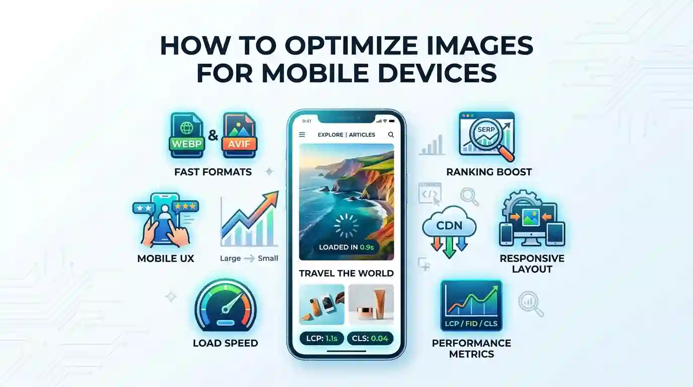
Learning how to Optimize Images for Mobile Devices is one of the fastest ways to improve page speed, user experience, Core Web Vitals, SEO performance, and conversion rates. Mobile users often browse on smaller screens, slower networks, and limited data plans, so large uncompressed images can quickly make a website feel slow and frustrating. This guide explains how to resize, compress, format, lazy load, and deliver responsive images so your website looks sharp while loading quickly on smartphones and tablets.
Table of Content
- What Does It Mean to Optimize Images for Mobile Devices?
- Why Mobile Image Optimization Matters for SEO
- Best Image Formats for Mobile Performance
- How to Resize Images for Mobile Screens
- How to Optimize Images for Mobile Devices Using Compression
- Responsive Images, Srcset, and Mobile-Friendly Delivery
- Lazy Loading Images for Faster Mobile Pages
- Image SEO: Alt Text, File Names, and Structured Context
- Common Mobile Image Optimization Mistakes
- Recommended Workflow for Website Owners
- Conclusion
- FAQs
What Does It Mean to Optimize Images for Mobile Devices?
To optimize images for mobile devices means preparing and delivering images in a way that keeps them visually clear, lightweight, responsive, and fast-loading on smartphones and tablets. It is not just about reducing image size. A complete mobile image optimization strategy includes file compression, correct dimensions, responsive image markup, next-generation formats, lazy loading, CDN delivery, descriptive alt text, and mobile-friendly design.
Mobile users interact with websites differently from desktop users. They scroll faster, expect instant loading, and often leave if a page feels heavy. Images are usually among the largest assets on a webpage, which means they can strongly affect loading speed, Largest Contentful Paint, bounce rate, and overall search visibility.
A mobile-optimized image should meet three goals:
It Should Load Quickly
Heavy images increase page weight and slow down rendering. When a mobile browser has to download a large desktop image, the user waits longer, especially on cellular networks. Google’s web.dev guidance explains that serving desktop-sized images to mobile users can waste significantly more data than needed, and responsive image delivery can improve loading performance.
It Should Look Sharp on Small Screens
Image quality still matters. Over-compressing an image can make it blurry, pixelated, or unprofessional. The goal is to balance quality and file size so the image looks crisp without being unnecessarily large.
It Should Adapt to Different Devices
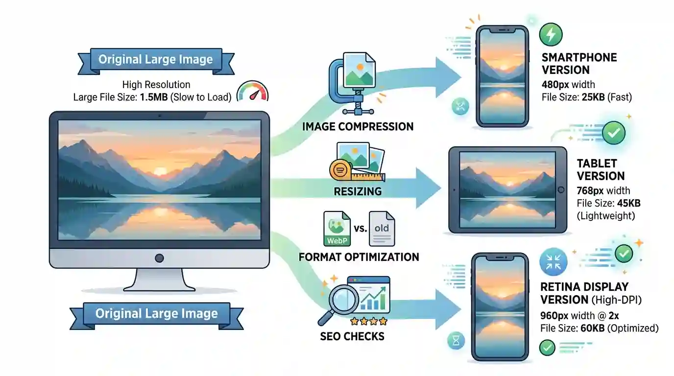
A phone, tablet, foldable device, and retina display may all require different image sizes. Responsive image techniques such as srcset, sizes, and the <picture> element help browsers choose the best image version for each screen. MDN explains that srcset lets developers provide multiple image sources so the browser can select the most suitable file.
Why Mobile Image Optimization Matters for SEO
Image optimization is not only a design task. It is a technical SEO, user experience, and performance strategy. Search engines aim to reward pages that provide helpful, accessible, and fast experiences. If your mobile pages are slow because images are too large, your rankings and conversions can suffer.
Mobile Page Speed Affects User Experience
Mobile visitors expect pages to load quickly. If a product image, blog header, hero banner, or gallery takes too long to appear, users may exit before reading the content. Slow mobile image loading can increase bounce rate and reduce session duration.
Images Influence Core Web Vitals
One of the most important performance metrics is Largest Contentful Paint, often called LCP. On many pages, the LCP element is a hero image, product image, featured image, or banner. If that image is oversized or delayed, the LCP score can become poor. Responsive image delivery can reduce the resource load duration of an LCP image, which helps improve the LCP experience.
Optimized Images Improve Crawl Efficiency
Search engine crawlers need to process your website content. Clean image file names, descriptive alt text, logical placement, and lightweight assets help search engines understand your content more easily. Image SEO also gives your visuals a better chance of appearing in image search results.
Better Images Can Increase Conversions
For ecommerce websites, service pages, food blogs, travel websites, portfolios, and SaaS landing pages, images help users make decisions. If images load quickly and look clear on mobile, visitors are more likely to trust the page, stay longer, and take action. For product-focused websites, you can also read this guide on how to Optimize Ecommerce Product Images for more conversion-focused image strategies.
Best Image Formats for Mobile Performance
Choosing the right image format is one of the most important steps in mobile optimization. Different formats serve different purposes, and the wrong format can make your files heavier than necessary.
JPEG
JPEG is commonly used for photographs, blog images, product photos, and large visual banners. It supports strong compression, which makes it useful when you need a balance between quality and file size. However, JPEG is lossy, meaning some detail is removed during compression.
Use JPEG for:
- Real-life photography
- Blog featured images
- Product lifestyle photos
- Large banners with many colors
Avoid JPEG for logos, icons, and graphics with sharp edges or transparency.
PNG
PNG is best for images that require transparency or crisp graphic details. It is often used for logos, icons, screenshots, and illustrations. However, PNG files can become very large, especially for photos.
Use PNG for:
- Transparent graphics
- Logos
- UI screenshots
- Simple illustrations
Avoid PNG for large photographic images unless transparency is required.
WebP
WebP is a modern image format designed to provide strong compression while maintaining good visual quality. It supports both lossy and lossless compression and can also handle transparency. For many websites, WebP is a strong option for mobile performance because it can reduce file size compared with older formats.
Use WebP for:
- Blog images
- Product photos
- Hero banners
- Thumbnails
- Mobile galleries
AVIF
AVIF is another next-generation image format that can provide excellent compression and quality. It is especially useful for websites that need very lightweight images while preserving strong visual details. However, workflow support and compatibility should be checked based on your CMS, CDN, and audience.
Use AVIF for:
- High-performance websites
- Large image-heavy pages
- Hero visuals
- Modern web projects
SVG
SVG is ideal for vector graphics such as logos, icons, simple illustrations, and interface elements. Because SVG is resolution-independent, it looks sharp on all screen sizes, including high-density mobile screens.
Use SVG for:
- Icons
- Logos
- Simple diagrams
- Scalable graphics
How to Resize Images for Mobile Screens
One of the biggest image optimization mistakes is uploading a massive image and relying on CSS to shrink it visually. For example, if your mobile layout displays an image at 360 pixels wide, there is usually no reason to make the phone download a 3000-pixel-wide image.
Match Image Dimensions to Display Size
Before uploading images, check how large they actually appear in your mobile layout. A blog content image may only need to be 700–900 pixels wide, while a full-width mobile hero image may need a larger version for high-density displays.
For most websites, it is smart to create several image widths, such as:
- 320 px for small phones
- 480 px for larger phones
- 768 px for tablets
- 1024 px for small laptops or large displays
- 1440 px for desktop hero sections
This allows browsers to choose the most suitable image instead of forcing every device to download the largest version.
Avoid Layout Shift
Always reserve space for images by defining width and height attributes or using proper aspect-ratio styling. When images load without reserved space, content may jump around. This creates a poor mobile experience and can harm visual stability.
Use the Correct Aspect Ratio
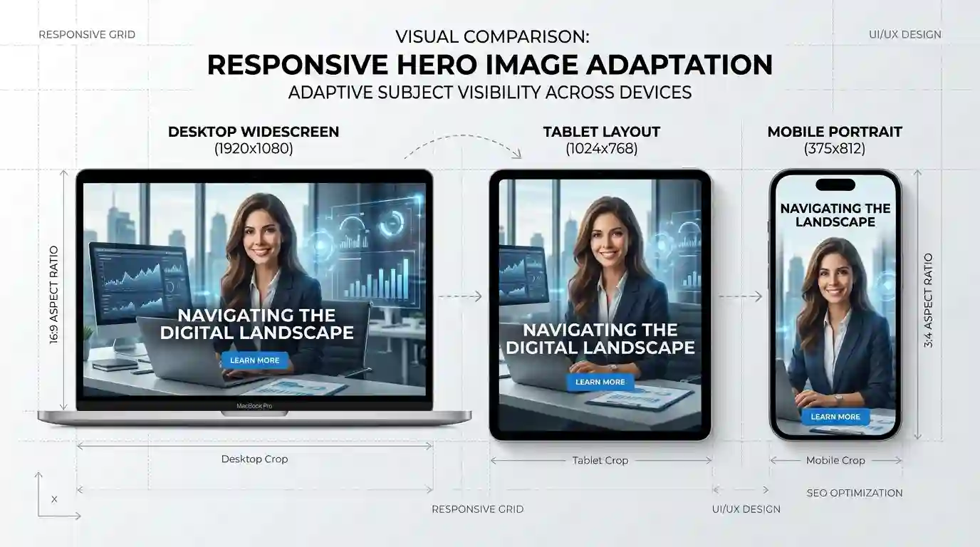
Mobile screens are narrow, so wide desktop banners may not work well. Instead of cropping important details accidentally, create mobile-specific crops. For example, a desktop hero image may use a 16:9 layout, while a mobile hero image may look better in 4:5 or 1:1.
How to Optimize Images for Mobile Devices Using Compression
Compression reduces image file size so images load faster. The key is to compress enough to improve performance without making the image look poor.
Lossy Compression
Lossy compression removes some image data to create a smaller file. It works well for photos and large visuals where a small reduction in quality is not noticeable. JPEG, WebP, and AVIF often use lossy compression.
Lossless Compression
Lossless compression reduces file size without removing visible data. It is useful for logos, icons, screenshots, and graphics that require sharp details. PNG and WebP can support lossless compression.
Find the Right Quality Level
For many web images, a quality range between 70 and 85 often provides a good balance. However, the best setting depends on the image. A detailed product photo may need higher quality, while a simple blog illustration may still look good at a lower setting.
Use Batch Optimization Tools
If your website has many images, manual optimization can become time-consuming. This is where online tools can help. You can use Image conversion tools to convert, resize, and prepare images for mobile-friendly delivery.
Remove Unnecessary Metadata
Images often contain extra metadata such as camera model, location, date, and editing information. This data is usually not needed for website display and can increase file size. Removing metadata helps make images lighter.
Responsive Images, Srcset, and Mobile-Friendly Delivery
Responsive images allow a browser to choose the right image file based on screen width, device pixel ratio, layout size, and network conditions. This is one of the most effective ways to optimize images for different mobile devices.
Use Srcset for Multiple Image Sizes
The srcset attribute gives the browser multiple image versions. The browser then chooses the most appropriate one. This prevents small mobile screens from downloading oversized desktop files.
Example concept:
A browser may choose:
- 400 px image for a small phone
- 800 px image for a retina phone
- 1200 px image for a tablet
- 1600 px image for a desktop screen
MDN’s image documentation explains that srcset can include multiple possible image sources, and width descriptors help browsers calculate which file best matches the rendered size.
Use Sizes to Describe Layout Width
The sizes attribute tells the browser how much space the image will take in the layout. Without this information, the browser may make a less efficient choice.
For example, an image may appear full-width on mobile but only half-width on desktop. The sizes attribute helps the browser select the right file for each situation.
Use the Picture Element for Art Direction
The <picture> element gives you more control over which image appears at different screen sizes. This is useful when you need different crops for mobile and desktop.
For example:
- Desktop: wide banner showing a full office scene
- Mobile: close crop showing the person’s face
- Tablet: medium crop showing the person and headline area
This is called art direction, and it helps ensure your image remains meaningful on every screen.
Use CSS Responsibly
CSS should prevent images from overflowing the mobile viewport. Google’s web.dev responsive image guidance recommends using flexible sizing and max-width: 100% so images do not overflow their containers.
Lazy Loading Images for Faster Mobile Pages
Lazy loading delays the loading of images until they are close to entering the user’s viewport. This is especially useful for long blog posts, category pages, galleries, tutorials, and ecommerce listings.
Why Lazy Loading Helps
On mobile, users may not scroll through the entire page. If all images load immediately, the browser wastes bandwidth on visuals the user may never see. Lazy loading helps the browser focus first on above-the-fold content.
Which Images Should Be Lazy Loaded?
Lazy load:
- Blog images below the intro
- Gallery images
- Related post thumbnails
- Product listing images below the first screen
- Decorative images lower on the page
Do not lazy load:
- Hero image
- Featured image above the fold
- LCP image
- Logo
- Important first-screen visuals
Lazy loading the main hero image can delay the most important visual and hurt perceived performance.
Use Native Lazy Loading
Modern browsers support native lazy loading using the loading=”lazy” attribute. This is simple and effective for many websites.
Image SEO: Alt Text, File Names, and Structured Context
Mobile image optimization is not only about speed. Search engines also need context. Well-optimized images can improve accessibility, topical relevance, and image search visibility.
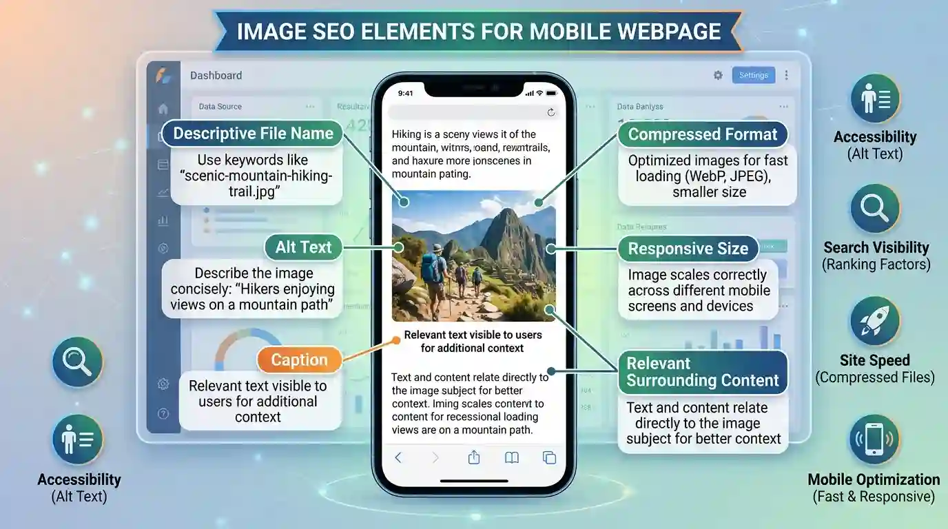
Write Descriptive File Names
Instead of uploading a file named IMG_9045.jpg, rename it with clear keywords before uploading.
Better examples:
- mobile-image-optimization-checklist.webp
- responsive-image-sizes-example.jpg
- compressed-product-image-mobile.webp
File names should be short, descriptive, and relevant.
Add Helpful Alt Text
Alt text describes the image for screen readers and search engines. It should be natural, useful, and specific. Do not stuff keywords.
Weak alt text:
“image optimization mobile SEO best image optimize”
Strong alt text:
“Example of responsive image sizes for mobile, tablet, and desktop screens”
Surround Images With Relevant Content
Search engines understand images better when the surrounding text is relevant. Place images near the section they support. Add captions when useful. Make sure the image, heading, and paragraph context all match.
Use Captions When They Add Value
Captions are useful when an image explains a process, compares results, or supports a tutorial. For example, a compression comparison image should include a caption explaining file size differences and visual quality.
Common Mobile Image Optimization Mistakes
Even experienced website owners often make small image mistakes that hurt mobile speed and SEO. Avoiding these issues can make your site faster and more professional.
Uploading Images That Are Too Large
Uploading a 4000 px image for a 400 px display area wastes bandwidth. Always resize images based on actual layout needs.
Using the Wrong Format
A PNG photo may be much heavier than a JPEG, WebP, or AVIF version. A JPEG logo may look blurry compared with SVG or PNG. Choose the format based on image type.
Ignoring Retina Displays
High-density mobile screens may need sharper images. This does not mean you should always upload massive files. Instead, use responsive image versions so retina devices can receive appropriate quality without forcing all users to download the largest image.
Over-Compressing Images
Compression is helpful, but too much compression can damage trust. Product photos, portfolio images, and food images should remain clear and appealing.
Forgetting About Thumbnails
Thumbnails should be optimized separately. Do not use the full-size image as a thumbnail. Create smaller thumbnail files for cards, related posts, and product grids.
Lazy Loading the Wrong Image
Do not lazy load the main above-the-fold image if it is the LCP element. Load critical images early and delay only non-critical images.
Missing Width and Height Attributes
When image dimensions are missing, the browser may not reserve the correct space. This can cause layout shift as images load.
Recommended Workflow for Website Owners
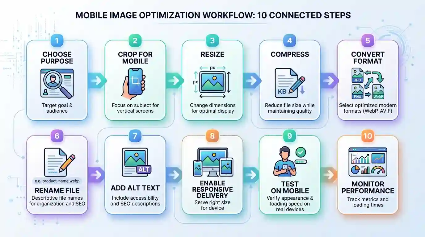
A clear workflow makes mobile image optimization easier and more consistent. Use the following process before uploading images to your website.
Step 1: Choose the Image Purpose
Decide whether the image is a hero image, product image, blog illustration, icon, screenshot, or thumbnail. The purpose determines the size, format, crop, and quality level.
Step 2: Crop for Mobile First
Check whether the subject remains visible on small screens. Create a separate mobile crop when necessary.
Step 3: Resize the Image
Export only the dimensions you need. Avoid uploading oversized originals directly to your CMS.
Step 4: Convert to the Best Format
Use WebP or AVIF when supported by your website setup. Use JPEG for photos when needed, PNG for transparency, and SVG for vector graphics.
Step 5: Compress the File
Compress the image while checking visual quality. Compare before and after versions to ensure the image still looks professional.
Step 6: Rename the File
Use a descriptive, keyword-relevant file name before uploading.
Step 7: Add Alt Text
Write natural alt text that describes the image and supports accessibility.
Step 8: Use Responsive Delivery
Enable responsive image sizes in your CMS, theme, CDN, or development framework. For custom websites, use srcset, sizes, and the <picture> element where needed.
Step 9: Test on Real Mobile Devices
Do not rely only on desktop previews. Check your images on actual smartphones and tablets. Look at loading speed, cropping, sharpness, and layout stability.
Step 10: Monitor Performance
Use tools like PageSpeed Insights, Lighthouse, Search Console, or your CDN analytics to identify heavy images and mobile performance issues.
Conclusion
Mobile image optimization is one of the most practical ways to improve website performance, SEO, and user experience. When images are too large, poorly formatted, or not responsive, they slow down mobile pages and create friction for visitors. But when images are resized, compressed, properly formatted, and delivered responsively, your website becomes faster, cleaner, and easier to use.
To get the best results, focus on the complete image workflow: choose the right format, create mobile-friendly crops, compress files, use descriptive file names, write helpful alt text, enable responsive image delivery, and test your pages on real devices. Whether you run a blog, ecommerce store, portfolio, business website, or online tool platform, optimized mobile images can help your content load faster, rank better, and convert more visitors.
FAQs
1. What is the best way to optimize images for mobile devices?
The best way is to resize images according to mobile display needs, compress them, use modern formats like WebP or AVIF, enable responsive image delivery, add width and height attributes, and lazy load non-critical images.
2. What image format is best for mobile websites?
WebP is a strong choice for most mobile websites because it offers good quality with smaller file sizes. AVIF can provide even better compression in many cases, while JPEG is still useful for photos and PNG is useful for transparency.
3. Should I use the same image for desktop and mobile?
Not always. You can use the same image subject, but mobile screens often need smaller dimensions or different crops. Responsive image techniques help deliver the right version to each device.
4. Does image optimization improve SEO?
Yes. Optimized images can improve page speed, Core Web Vitals, accessibility, user engagement, and image search visibility. These factors can support better SEO performance.
5. How large should mobile images be?
The ideal size depends on where the image appears. A content image may only need to be 700–900 pixels wide, while a full-width hero image may need larger versions for high-density screens. Avoid uploading images much larger than their display size.
6. Is lazy loading good for mobile images?
Yes, lazy loading is useful for below-the-fold images because it saves bandwidth and improves initial page loading. However, important above-the-fold images, especially the hero or LCP image, should usually load immediately.
7. How do I reduce image file size without losing quality?
Use proper resizing, choose the right format, compress at a balanced quality setting, remove unnecessary metadata, and compare the visual result before publishing.
8. What is responsive image delivery?
Responsive image delivery means providing multiple image versions so the browser can choose the best file based on screen size, layout, resolution, and device conditions.