

Summary
Choosing the Best Dimensions for Blog Images helps your content look professional, load faster, rank better in search engines, and deliver a smoother reading experience across desktop, tablet, and mobile screens. The right image size depends on where the image appears: featured image, in-content image, infographic, thumbnail, sidebar graphic, or social sharing preview. This guide explains ideal blog image dimensions, aspect ratios, file formats, compression tips, responsive image practices, and SEO optimization methods so your blog visuals stay sharp without slowing down your website.
Table of Contents
- What Are Blog Image Dimensions?
- Why Image Size Matters for SEO and User Experience
- Best Dimensions for Blog Images by Placement
- Best Dimensions for Blog Images for WordPress, SEO, and Social Sharing
- Recommended Aspect Ratios for Blog Images
- Featured Image Dimensions for Blog Posts
- In-Content Image Sizes for Better Readability
- Blog Image File Size, Format, and Compression
- How to Avoid Blurry Blog Images
- Conclusion
- FAQs
What Are Blog Image Dimensions?
Blog image dimensions refer to the width and height of an image, usually measured in pixels. For example, an image that is 1200 pixels wide and 628 pixels tall is written as 1200 × 628 px. These dimensions decide how large the image appears on a web page and how sharp it looks on different devices.
A common mistake many bloggers make is uploading images without thinking about their actual display size. A photo taken from a modern camera or downloaded from a stock image platform may be 4000 pixels wide or more. That might look high quality, but it can create a heavy file that slows down your blog. On the other hand, uploading a very small image and stretching it across a wide blog layout can make the image look blurry or pixelated.
The goal is to use image dimensions that are large enough to look crisp but not so large that they hurt page speed. A balanced approach improves visual quality, user experience, Core Web Vitals, and organic search performance.
Google also recommends using descriptive, high-quality images that support the page content. You can review Google’s official guidance on image optimization through its Google Images SEO best practices.
Why Image Size Matters for SEO and User Experience
Images play a major role in how readers experience a blog post. A well-sized image can explain a concept, break up long text, support storytelling, and improve visual appeal. Poorly sized images, however, can damage both design and performance.
Page Speed and Loading Time
Large image files are one of the most common reasons websites load slowly. When a blog page contains oversized images, browsers need more time to download and render those files. This can increase bounce rate, especially for mobile visitors using slower internet connections.
If your blog image is displayed at 800 px wide, uploading a 3500 px wide file is usually unnecessary. Resizing and compressing the image before upload can reduce file weight while keeping it sharp.
For faster performance, you can convert heavy JPG images into lightweight WebP format using the Optimize image for blogs Tool.
Visual Quality and Professional Design
Correct image dimensions help your blog look clean and consistent. If every featured image uses a different shape, your blog archive pages may look messy. If in-content graphics are too wide, they may overflow the layout. If thumbnails are too small, they may look unclear on high-resolution screens.
Using consistent image ratios creates a polished design system. It also helps readers move through your article more comfortably.
Mobile Responsiveness
Most blog readers now visit websites from mobile devices. That means your images must adapt to different screen sizes. A blog image should look clear on a 1440 px desktop screen and still fit properly on a 390 px mobile screen.
Responsive images, proper aspect ratios, and compressed file formats help your blog visuals perform well on all devices.
Image SEO and Search Visibility
Optimized image dimensions can support better image SEO. Search engines consider page performance, content relevance, image alt text, filenames, surrounding text, and image accessibility. Well-optimized images can appear in Google Images, improve topical relevance, and help users understand your content faster.
Best Dimensions for Blog Images by Placement
Different blog image placements need different dimensions. A featured image should usually be wider and more visually striking, while an in-content screenshot may need a different shape depending on the subject.
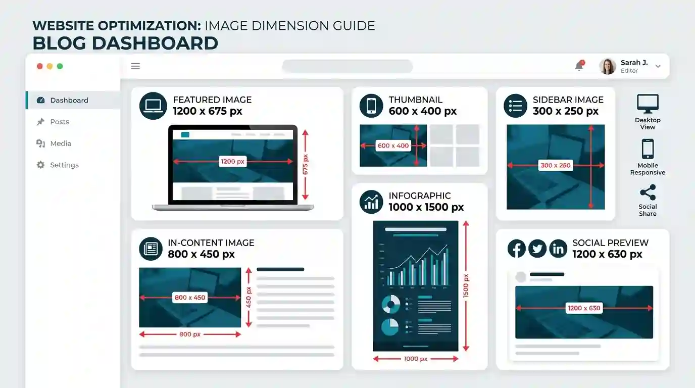
Recommended Blog Image Size Chart
For most modern blogs, these dimensions work well:
| Image Placement | Recommended Dimensions | Best Use |
| Featured blog image | 1200 × 675 px | Blog headers, archives, social sharing |
| Standard in-content image | 800 × 450 px | Explanatory blog visuals |
| Wide in-content image | 1200 × 675 px | Full-width blog layouts |
| Infographic | 1000 × 1500 px or taller | Step-by-step guides, data visuals |
| Blog thumbnail | 600 × 400 px | Blog cards, related posts |
| Sidebar image | 300 × 250 px | Ads, banners, small graphics |
| Pinterest image | 1000 × 1500 px | Pinterest sharing |
| Open Graph image | 1200 × 630 px | Facebook, LinkedIn, social previews |
| Twitter/X card image | 1200 × 675 px | Social media previews |
These are practical dimensions, not strict rules. The best size depends on your website theme, content width, and visual style.
Best Dimensions for Blog Images for WordPress, SEO, and Social Sharing
WordPress, search engines, and social platforms all handle images slightly differently. Choosing flexible dimensions helps your images work well across many use cases.
WordPress Blog Image Dimensions
For WordPress blogs, a featured image of 1200 × 675 px is a strong choice because it uses a 16:9 aspect ratio. This ratio fits many blog themes, card layouts, and hero sections. Some themes may crop images automatically, so it is important to check your theme’s recommended featured image size.
A good WordPress image setup may look like this:
- Featured image: 1200 × 675 px
- Blog content image: 800 × 450 px
- Thumbnail: 600 × 400 px
- Large header image: 1600 × 900 px
- Infographic: 1000 × 1500 px or 1200 × 1800 px
For WordPress, avoid uploading extremely large images unless your layout truly needs them. A 3000 px wide image is usually unnecessary for a standard blog post.
SEO-Friendly Blog Image Dimensions
From an SEO perspective, image dimensions should support fast loading, clear display, and content relevance. Search engines do not reward large images simply because they are large. They reward useful pages that deliver a good experience.
SEO-friendly image dimensions should be:
- Large enough to look sharp
- Small enough to load quickly
- Consistent with the page layout
- Responsive across devices
- Compressed without visible quality loss
- Supported by descriptive filenames and alt text
For most SEO blog posts, 1200 px wide images are enough for featured visuals, while 800 px wide images are suitable for regular in-article graphics.
Social Sharing Image Dimensions
When your blog post is shared on Facebook, LinkedIn, or X, the social platform often pulls the Open Graph image. If your image is too small or has the wrong ratio, it may be cropped badly.
The safest social sharing size is usually 1200 × 630 px. This size works well for Facebook and LinkedIn link previews. For X cards, 1200 × 675 px is also commonly used because it follows a 16:9 ratio.
A practical solution is to design your featured blog image at 1200 × 675 px while keeping the most important text and visual elements centered. That way, minor cropping on social platforms will not remove important information.
Recommended Aspect Ratios for Blog Images
Aspect ratio is the relationship between image width and height. For example, 1200 × 675 px has a 16:9 aspect ratio. Understanding aspect ratios helps you keep your blog design consistent.
16:9 Ratio
The 16:9 ratio is one of the most useful choices for blog images. It works well for featured images, hero banners, YouTube thumbnails, tutorials, and wide in-content visuals.
Common 16:9 dimensions include:
- 1200 × 675 px
- 1600 × 900 px
- 800 × 450 px
This ratio is ideal for modern blog layouts because it looks cinematic and balanced.
4:3 Ratio
The 4:3 ratio works well for screenshots, educational diagrams, and product images. It is slightly taller than 16:9, which can make it easier to show interface details.
Common 4:3 dimensions include:
- 800 × 600 px
- 1024 × 768 px
- 1200 × 900 px
Use this ratio when visual clarity is more important than a wide banner look.
1:1 Square Ratio
Square images are useful for author boxes, product highlights, social snippets, and blog cards. They also work well in grid layouts where consistency matters.
Common square dimensions include:
- 600 × 600 px
- 800 × 800 px
- 1080 × 1080 px
Square visuals are not always ideal for long-form blog content, but they are excellent for thumbnails and social media repurposing.
2:3 Vertical Ratio
The 2:3 ratio is best for Pinterest graphics and vertical infographics. These images take more vertical space and can perform well when users save or share content.
Common 2:3 dimensions include:
- 1000 × 1500 px
- 1200 × 1800 px
Use vertical images carefully inside blog posts because they can interrupt reading flow if they are too tall.
Featured Image Dimensions for Blog Posts
The featured image is one of the most important visuals in a blog post. It appears at the top of the article, on blog archive pages, in related post sections, and often in social media previews.
Best Featured Image Size
The best featured image size for most blogs is 1200 × 675 px. This size is wide enough to look sharp on desktop screens and flexible enough for responsive layouts. It also follows the 16:9 aspect ratio, which works well with many WordPress themes and modern website designs.
If your blog uses full-width hero banners, you may prefer 1600 × 900 px. However, you should compress the file properly so it does not slow down the page.
Featured Image Design Tips
A good featured image should:
- Clearly represent the article topic
- Use readable text only when necessary
- Keep the main subject centered
- Avoid placing important elements near the edges
- Match your brand colors and style
- Look clean on both desktop and mobile
For an article about blog image dimensions, the featured image could include a laptop screen, image size guides, pixel rulers, and responsive device mockups.
In-Content Image Sizes for Better Readability
In-content images are the visuals placed inside the body of your blog post. These may include screenshots, diagrams, charts, product photos, examples, comparison tables, and illustrations.
Standard In-Content Images
For most blog posts, 800 × 450 px is a strong standard size for in-content images. It is large enough to be clear but not unnecessarily heavy. If your content area is wider, you can use 1000 × 563 px or 1200 × 675 px.
The image should match the width of your blog content container. If your blog content area is only 760 px wide, uploading a 2000 px wide image does not provide much benefit.
Screenshots and Tutorials
Screenshots may need more width depending on the details shown. For software tutorials, dashboards, analytics reports, and step-by-step guides, use images between 1000 and 1400 px wide. This helps readers see buttons, menus, and labels clearly.
However, always compress screenshots before uploading. PNG screenshots can become large, especially when they contain detailed interfaces. WebP is often a better format for reducing file size.
Infographics and Visual Guides
Infographics are usually taller than standard blog images. A good infographic size is 1000 × 1500 px or 1200 × 1800 px. For longer infographics, you can go taller, but be careful with file size.
Large infographics should be compressed and possibly lazy-loaded so they do not hurt initial page speed.

Blog Image File Size, Format, and Compression
Dimensions are only one part of image optimization. File size and format matter just as much.
Ideal Blog Image File Size
For most blog images, try to keep file size under 200 KB when possible. Featured images may sometimes be between 200 KB and 400 KB if they need more detail, but smaller is usually better.
A simple target could be:
- Small thumbnails: under 100 KB
- In-content images: under 150–250 KB
- Featured images: under 250–400 KB
- Infographics: under 500 KB when possible
The exact file size depends on the complexity of the image. A simple graphic with flat colors will compress more easily than a detailed photograph.
Best Image Formats for Blogs
The most common blog image formats are JPG, PNG, WebP, and SVG.
JPG is useful for photographs and complex images. PNG is useful for transparent graphics, screenshots, and images with sharp lines, but it can create larger files. WebP is often the best option for blogs because it provides strong compression while keeping good visual quality. SVG is best for logos, icons, and simple vector graphics.
For most blog posts, WebP is a smart choice because it helps improve speed and performance.
Compression Without Quality Loss
Image compression reduces file size. Lossless compression keeps all image data, while lossy compression removes some data to create a smaller file. For blog images, moderate lossy compression is often acceptable because it can greatly reduce file size with little visible difference.
Before uploading images, resize them to the correct dimensions, convert them to a modern format, and compress them. This process improves page speed and user experience.
How to Avoid Blurry Blog Images
Blurry blog images usually happen because of stretching, poor compression, wrong dimensions, or low-resolution source files. If your image is 500 px wide but your blog displays it at 1000 px wide, the browser stretches the image, making it appear soft or pixelated.
For a deeper guide, read Why Website Images Look Blurry.
Use Images Larger Than the Display Size
Your image should be at least as wide as the space where it appears. If your content column is 800 px wide, use an image that is at least 800 px wide. For retina or high-density displays, you may use a slightly larger version, such as 1200 px wide, and let the browser scale it down.
Do Not Overcompress Images
Compression is useful, but extreme compression can create artifacts, noise, and blurry edges. Text inside images can become especially hard to read if compression is too aggressive.
When compressing screenshots or graphics with text, preview the final image before publishing.
Maintain the Correct Aspect Ratio
If an image is forced into a container with a different ratio, it may look stretched or squeezed. For example, placing a square image into a wide 16:9 container without cropping can distort the visual.
Use consistent aspect ratios for featured images, thumbnails, and blog cards to avoid layout problems.
Use Descriptive Alt Text
Alt text does not directly fix blurry images, but it improves accessibility and image SEO. It helps search engines and screen readers understand what the image represents.
Good alt text should describe the image naturally. For example:
“Recommended blog image dimensions chart showing featured image, thumbnail, infographic, and social preview sizes.”
Avoid keyword stuffing. The alt text should be helpful, not repetitive.
Conclusion
The best blog image dimensions depend on where the image appears, but the most reliable general size for featured blog images is 1200 × 675 px. For standard in-content visuals, 800 × 450 px works well for many layouts. For social sharing, 1200 × 630 px is a safe Open Graph size, while vertical infographics often perform best around 1000 × 1500 px.
The key is balance. Your images should be large enough to look crisp, but not so large that they slow down your site. Use consistent aspect ratios, compress every image, choose modern formats like WebP, and make sure your images are responsive on mobile devices.
When you combine the right dimensions with proper file size, alt text, descriptive filenames, and image compression, your blog becomes faster, cleaner, more professional, and more SEO-friendly.
FAQs
What is the best size for blog featured images?
The best size for most blog featured images is 1200 × 675 px. This uses a 16:9 aspect ratio and works well for WordPress themes, blog cards, and responsive layouts.
What is the best image size for SEO?
For SEO, blog images should be large enough to look sharp but compressed enough to load quickly. A width of 800 px for in-content images and 1200 px for featured images is usually a good balance.
What image format is best for blog posts?
WebP is one of the best formats for blog posts because it offers strong compression and good visual quality. JPG is also useful for photos, while PNG is better for transparent graphics and some screenshots.
How big should blog images be in file size?
Most blog images should ideally be under 200 KB when possible. Featured images may be slightly larger, but they should still be compressed to avoid slow loading.
Why do my blog images look blurry?
Blog images often look blurry when they are uploaded too small, stretched beyond their original dimensions, compressed too much, or displayed in the wrong aspect ratio.
Should I use the same image size for every blog post?
You should use consistent dimensions for similar image types. For example, use one standard size for featured images and another for in-content images. This keeps your blog design clean and professional.
Are larger images better for blog SEO?
Not always. Larger images may look sharp, but they can slow down your page if they are not optimized. SEO-friendly images should balance quality, dimensions, compression, and loading speed.
What is the best image size for social sharing?
A good social sharing image size is 1200 × 630 px for Facebook and LinkedIn previews. For X cards and wide previews, 1200 × 675 px is also a strong option.