Summary
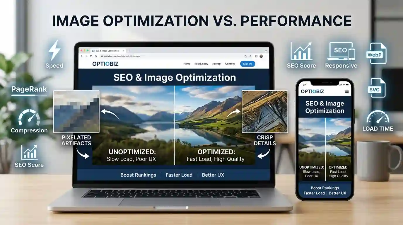
Why Website Images Look Blurry is a common problem caused by low-resolution uploads, excessive compression, incorrect image dimensions, CSS stretching, poor responsive image settings, lazy loading issues, and display differences on mobile or retina screens. This guide explains the main causes of blurry website images and shows practical ways to fix them for sharper visuals, faster performance, and better user experience.
Table of Content
- Why Website Images Look Blurry: The Most Common Causes
- Why Website Images Look Blurry on Mobile and Retina Screens
- How Image Resolution Affects Website Clarity
- Image Compression and File Formats
- CSS Scaling, Cropping, and Aspect Ratio Problems
- Responsive Images, Srcset, and Browser Rendering
- Lazy Loading and Blurry Placeholder Images
- How to Fix Blurry Website Images
- Conclusion
- FAQs
Why Website Images Look Blurry
Images are one of the first things visitors notice on a website. A crisp product image, a clean blog graphic, or a sharp hero banner can instantly make a website feel professional. But when website images look blurry, pixelated, stretched, or soft, the whole page can feel low quality—even if the content, design, and branding are strong.
Blurry website images are not always caused by a bad photo. In many cases, the original image is fine, but the website displays it incorrectly. The issue may come from compression settings, wrong dimensions, poor image optimization, CSS resizing, browser scaling, responsive image mistakes, or using the wrong file format.
For website owners, bloggers, designers, developers, and SEO professionals, image clarity matters for more than appearance. Clear images improve user experience, increase trust, help visitors understand content faster, and can support better engagement. On the other hand, blurry images can reduce conversion rates, make products look less valuable, and create a poor impression of your brand.
This article explains why website images become blurry, how to identify the root cause, and what you can do to fix the problem without slowing down your website.
Why Website Images Look Blurry: The Most Common Causes
Website images usually look blurry because the displayed image does not match the size, quality, or rendering requirements of the screen. A small image may be stretched into a large space. A high-quality image may be compressed too aggressively. A browser may load a low-resolution version for performance reasons. A design may crop or scale images incorrectly.
Let’s break down the most common causes.
1. The Uploaded Image Is Too Small
One of the biggest reasons images look blurry is that the original file is smaller than the space where it appears on the page.
For example, if you upload an image that is 600 pixels wide and display it in a 1200-pixel-wide hero section, the browser has to enlarge it. When an image is enlarged beyond its original resolution, the browser fills in missing pixels. This creates a soft, blurry, or pixelated appearance.
This often happens with:
- Hero banners
- Product images
- Blog featured images
- Background images
- Portfolio galleries
- Website sliders
- Full-width section images
A simple rule is to upload images at least as large as the maximum display size. For retina and high-density screens, you may need images that are two times larger than the display size.
2. The Image Is Over-Compressed
Image compression reduces file size, which helps website speed. But too much compression can destroy detail. This is especially common with JPEG and JPG images.
Over-compressed images may show:
- Blurry edges
- Color banding
- Blocky artifacts
- Loss of texture
- Washed-out details
- Rough gradients
Compression is useful, but it must be balanced. A smaller image file is good for performance, but not if it makes your brand, product, or content look poor.
For example, a product photo with detailed fabric, jewelry, food, or electronics needs enough image quality to preserve texture. Compressing it too much can make the product look cheap or unclear.
3. The Image Is Stretched by CSS
Sometimes the image file itself is sharp, but CSS stretches it in the browser.
This can happen when a stylesheet uses rules such as:
width: 100%; height: 500px;
If the image does not match the container’s shape, the browser may stretch it horizontally or vertically. This causes distortion and blur.
Another common issue is using fixed width and height values without preserving the aspect ratio. When an image’s natural ratio is changed, it may look warped, soft, or squeezed.
Good CSS image handling usually includes:
max-width: 100%; height: auto;
This allows the image to scale naturally while keeping its original proportions.
4. The Wrong Image Format Is Used
Different image formats work better for different purposes. Using the wrong format can reduce clarity or increase file size unnecessarily.
Common formats include:
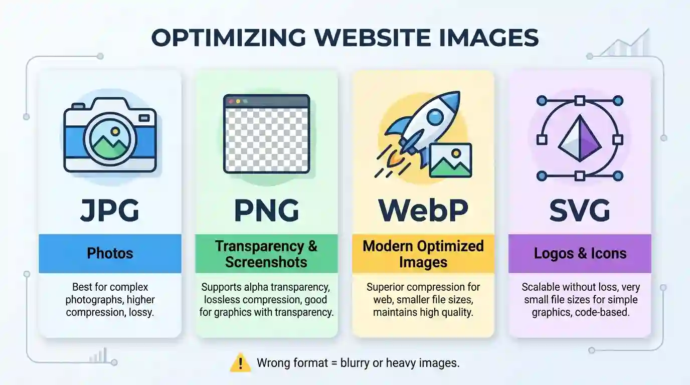
- JPEG/JPG: Good for photos, but quality drops with heavy compression.
- PNG: Good for transparency, logos, screenshots, and graphics with sharp edges.
- WebP: Good for modern web optimization with smaller file sizes.
- AVIF: Strong compression and quality, but compatibility should be checked.
- SVG: Best for icons, logos, and vector graphics.
If you use JPEG for a logo with text, the edges may look fuzzy. If you use PNG for a large photo, the file may become unnecessarily heavy. If you use a tiny thumbnail as a full-size image, it will look blurry regardless of the format.
If you need to convert image files for better compatibility or smaller size, you can use the PNG → JPG Converter to quickly change PNG images into JPG format when transparency is not required.
Why Website Images Look Blurry on Mobile and Retina Screens
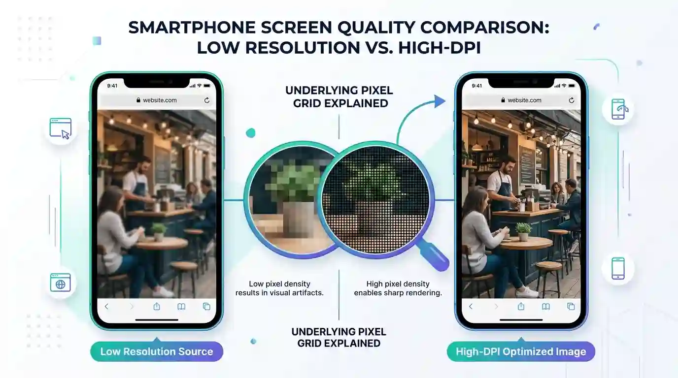
Images that look fine on a desktop monitor may look blurry on a mobile phone, tablet, or retina display. This happens because high-density screens use more physical pixels to display the same visual area.
What Are Retina and High-DPI Displays?
A standard screen may use one physical pixel for one CSS pixel. A retina or high-DPI screen may use two, three, or more physical pixels for one CSS pixel. This makes text and graphics look sharper—but only if the image has enough resolution.
For example, an image displayed at 400 pixels wide may need an 800-pixel-wide source file to look sharp on a 2x retina screen. If the browser only has a 400-pixel-wide file, the image may appear soft.
This is why many websites use responsive images with multiple sizes. The browser can choose the best version depending on screen size, pixel density, and layout.
Mobile Cropping Can Reduce Image Quality
Mobile layouts often crop or resize images differently than desktop layouts. A wide desktop banner may become a narrow mobile image. If the image is not prepared for multiple screen sizes, important details may be cropped, stretched, or compressed.
This is especially noticeable in:
- Hero sections
- E-commerce product galleries
- Blog thumbnails
- Portfolio cards
- Landing page banners
- Social proof sections
To prevent this, designers should create image variations for desktop, tablet, and mobile. Developers should also use responsive image attributes so the browser can serve the right version.
How Image Resolution Affects Website Clarity
Image resolution is one of the most important factors in website image quality. Resolution refers to the number of pixels in an image, usually measured as width × height.
For example:
- 800 × 600 pixels
- 1200 × 800 pixels
- 1920 × 1080 pixels
- 2400 × 1600 pixels
The more pixels an image has, the more detail it can contain. But bigger is not always better. Very large images can slow down a website if they are not optimized.
Display Size vs. File Size
It is important to understand the difference between image dimensions and image file size.
Image dimensions describe the pixel width and height. File size describes how heavy the image is in KB or MB.
A 2000-pixel-wide image might be 200 KB if compressed well, or 5 MB if unoptimized. A large file can slow page loading, while a small low-resolution image can look blurry.
The goal is to use the right dimensions with smart compression.
Avoid Uploading Tiny Images for Large Sections
If your website theme recommends a 1600 × 900 hero image, uploading a 700 × 400 image will usually look poor. The browser may stretch it to fit the design, creating blur.
For common website areas, consider these general image size ranges:
- Blog featured image: 1200 × 675 or larger
- Hero banner: 1600 × 900 or larger
- Product image: 1000 × 1000 or larger
- Full-width background: 1920 × 1080 or larger
- Logo: SVG preferred, or high-resolution PNG
These are not fixed rules, but they are useful starting points.
Image Compression and File Formats
Image optimization is a balance between quality and speed. Search engines and users prefer fast websites, but visitors also expect sharp visuals. Poor compression settings can cause website images to look blurry even when the original image was clear.
Lossy vs. Lossless Compression
There are two major types of compression:
Lossy compression removes some image data to reduce file size. JPEG, WebP, and AVIF often use lossy compression. This works well for photographs, but too much compression causes visible quality loss.
Lossless compression reduces file size without removing image detail. PNG often uses lossless compression. This is better for graphics, icons, screenshots, and images with text.
When to Use JPEG
JPEG is commonly used for photographs because it can reduce file size significantly. It works well for blog images, lifestyle photos, product photos, and banners.
However, JPEG is not ideal for:
- Logos
- Icons
- Screenshots with text
- Transparent images
- Flat graphics with sharp edges
When to Use PNG
PNG is useful when you need transparency or sharp edges. It is often better for logos, interface screenshots, diagrams, and graphics with text.
However, PNG files can be large. If the image does not need transparency, converting it to JPG or WebP may improve loading speed.
When to Use WebP or AVIF
WebP and AVIF are modern image formats designed for better web performance. They can often deliver good image quality at smaller file sizes than traditional formats.
Many modern websites use WebP for optimized images while keeping fallback formats for older browsers.
For a deeper technical understanding of responsive image handling, you can review the official MDN responsive images guide, which explains how browsers choose image sources for different screen sizes and resolutions.
CSS Scaling, Cropping, and Aspect Ratio Problems
Even a high-quality image can look blurry if the website layout handles it incorrectly. CSS determines how images appear on the page, and poor styling can create major visual issues.
Forced Width and Height
When developers force both width and height, the image may lose its natural proportions. For example, a square image forced into a wide rectangle may become stretched. A portrait image forced into a short banner may appear squeezed.
This can make images look:
- Blurry
- Distorted
- Cropped badly
- Unprofessional
- Visually inconsistent
Object-Fit Issues
The CSS object-fit property controls how images fill their container.
Common values include:
- cover
- contain
- fill
- none
- scale-down
Using object-fit: cover; can make an image fill the container without distortion, but it may crop parts of the image. Using object-fit: fill; may stretch the image and cause distortion.
For product images, portraits, and important visuals, cropping must be handled carefully.
Background Images Can Look Blurry
CSS background images are often used for hero sections. If the background image is too small, the browser may enlarge it across the full screen. This can make the entire banner look blurry.
To fix this, use a background image that is large enough for desktop screens and optimized enough to load quickly.
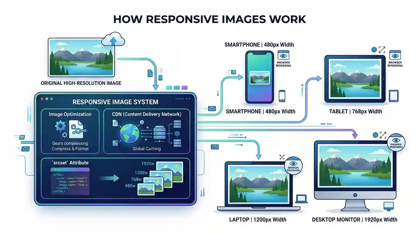
Responsive Images, Srcset, and Browser Rendering
Responsive images help browsers load the best image size for each device. Without responsive image settings, the browser might load a small image on a large screen or a large image on a small screen.
What Is Srcset?
The srcset attribute allows developers to provide multiple versions of the same image. The browser can choose the most suitable one based on screen size, layout width, and pixel density.
For example, you might provide:
- 480px image for small phones
- 768px image for tablets
- 1200px image for laptops
- 1920px image for large desktop screens
This helps maintain image quality while avoiding unnecessary file size.
Why Responsive Images Matter for SEO
Responsive images improve user experience and performance. When images are properly sized, pages load faster and look sharper. This can support better engagement, lower bounce rates, and stronger Core Web Vitals.
Google does not reward blurry images directly, but visual quality and speed both influence how users interact with a page. A fast-loading page with clear images is more likely to satisfy visitors.
Browser Image Selection Problems
Sometimes the browser loads the wrong image size because of incorrect sizes values, missing srcset, theme settings, CDN transformations, or page builder output.
If the browser loads a thumbnail where a full-size image should appear, the result will look blurry. This often happens in CMS platforms, WordPress themes, e-commerce builders, and custom templates.
Lazy Loading and Blurry Placeholder Images
Lazy loading delays image loading until the image is close to appearing on the screen. This improves performance because the browser does not load every image immediately.
However, lazy loading can sometimes make images look blurry temporarily or permanently.
Blurry Placeholders
Some websites use low-quality image placeholders, also called LQIP. These are tiny blurred versions of the real image. They load quickly and are replaced by the full image later.
This technique can look stylish when implemented correctly. But if the full image fails to load, loads too slowly, or is blocked by a script issue, visitors may only see the blurry placeholder.
Lazy Loading Plugin Problems
In WordPress and other CMS platforms, lazy loading plugins can conflict with themes, page builders, sliders, galleries, or CDN image optimization tools. These conflicts may cause the wrong image version to appear.
You may notice:
- Images stay blurry after loading
- Images sharpen only after scrolling
- Product thumbnails look soft
- Gallery images load in the wrong size
- Above-the-fold images appear delayed
To understand the concept better, read this guide on What Is Lazy Loading for Images.
Avoid Lazy Loading Critical Images
Important above-the-fold images, such as hero banners and main product images, should usually load immediately. Lazy loading them may create a poor first impression or cause layout shifts.
Images below the fold are better candidates for lazy loading.
How to Fix Blurry Website Images
Now that you know the causes, let’s look at practical fixes.
1. Upload Images at the Correct Dimensions
Check the display size of the image area. If your hero section displays at 1600 pixels wide, upload an image that is at least 1600 pixels wide. For retina displays, consider uploading a 2x version when needed.
Do not upload tiny images and expect them to look sharp in large spaces.
2. Use the Right Image Format
Choose the correct format based on image type:
- Use JPG for photographs.
- Use PNG for transparency and sharp graphics.
- Use SVG for logos and icons.
- Use WebP for modern optimized delivery.
- Use AVIF when supported and tested.
Using the right format helps maintain image clarity while keeping file size manageable.
3. Reduce Compression Intensity
If images look soft or blocky, compression may be too aggressive. Increase the quality setting slightly and compare the result.
For JPG images, many websites use a quality range between 70 and 85, depending on the image. For detailed product photos, use higher quality. For simple blog graphics, moderate compression may be enough.
4. Fix CSS Image Scaling
Review your CSS and make sure images are not being stretched unnaturally.
Use rules such as:
max-width: 100%; height: auto;
For image containers, use object-fit: cover; carefully. Make sure important parts of the image are not cropped.
5. Set Proper Width and Height Attributes
Adding width and height attributes helps browsers reserve the correct space before the image loads. This can improve layout stability and reduce visual shifting.
It also helps browsers understand the intended image dimensions.
6. Use Responsive Images
Use srcset and sizes to provide multiple image versions. This allows browsers to choose the right file for each device.
For WordPress users, many themes generate responsive image sizes automatically. However, theme settings, CDN tools, or custom code may still need adjustment.
7. Check CDN and Image Optimization Settings
A CDN or image optimization service may automatically resize, compress, or convert images. This can improve performance, but incorrect settings may produce blurry results.
Check whether your CDN is:
- Serving thumbnail versions
- Compressing images too much
- Converting images incorrectly
- Resizing images below display size
- Caching old blurry versions
Clear the cache after changing image settings.
8. Avoid Screenshots With Low Pixel Density
Screenshots often look blurry when captured at a small size and then enlarged. If you need screenshots for tutorials, software reviews, or documentation, capture them at a high resolution.
Avoid enlarging screenshots beyond their natural size. For UI images with text, PNG or WebP may preserve clarity better than heavily compressed JPG.
9. Use SVG for Logos and Icons
Logos and icons should not be blurry. If possible, use SVG files because they are vector-based and scale cleanly at any size.
Raster formats like JPG and PNG are pixel-based. If they are enlarged too much, they lose sharpness. SVG graphics stay crisp on desktop, mobile, and retina screens.
10. Test Images on Real Devices
Do not rely only on desktop preview. Test your website on:
- Mobile phones
- Tablets
- Retina laptops
- Large desktop monitors
- Different browsers
- Different internet speeds
An image may look sharp on one device and blurry on another due to responsive image behavior or pixel density.
Common Website Areas Where Images Become Blurry
Blurry images can appear anywhere on a site, but some areas are more likely to have problems.
Hero Banners
Hero banners are usually large and full-width. They need high-resolution images. If the uploaded image is too small, the blur becomes obvious.
Product Pages
E-commerce product photos must be sharp. Blurry product images can reduce trust and hurt sales. Use high-quality source files, zoom-ready images, and consistent aspect ratios.
Blog Featured Images
Blog thumbnails and featured images often get resized by CMS platforms. Make sure the selected image size is not a tiny thumbnail.
Logos
A blurry logo makes a website look unprofessional. Use SVG whenever possible. If using PNG, upload a high-resolution version with a transparent background.
Sliders and Carousels
Sliders often crop images into fixed containers. If each slide has different dimensions, some images may stretch or blur.
Background Sections
Background images often cover large areas. Use properly sized images and avoid repeating small backgrounds unless they are designed as patterns.
Image SEO Benefits of Clear Website Images
Fixing blurry images is not only a design task. It also supports SEO and user engagement.
Sharp, optimized images can help with:
- Better visual experience
- Longer time on page
- Stronger product presentation
- Better perceived trust
- Improved accessibility when paired with alt text
- Faster loading when properly compressed
- Lower bounce rates
- Better content quality
Image SEO also includes descriptive file names, meaningful alt text, proper image dimensions, structured data where relevant, and fast delivery through caching or CDN systems.
For example, instead of uploading an image named IMG_9843.jpg, use a descriptive name like sharp-product-image-example.jpg. This helps with organization and image search relevance.
Conclusion
Blurry website images usually happen because of a mismatch between image quality, display size, compression, format, CSS, and device requirements. The image may be too small, over-compressed, stretched by CSS, served in the wrong responsive size, or displayed on a high-DPI screen without enough resolution.
The best fix is to start with a high-quality source image, resize it correctly, choose the right format, compress it carefully, and use responsive image techniques. You should also check lazy loading, CDN settings, CSS rules, and device previews.
Clear images make your website look more professional, improve user trust, and support a better browsing experience. Whether you run a blog, business website, portfolio, or online store, sharp visuals are a key part of modern web quality.
FAQs
1. Why do my website images look blurry after uploading?
Your images may look blurry after uploading because the website is resizing them, compressing them, or displaying a smaller version than needed. The original image may also be too small for the area where it appears.
2. Why do images look clear on desktop but blurry on mobile?
Mobile and retina screens have higher pixel density. If the image source does not have enough resolution, it may appear soft or blurry on those screens.
3. Does image compression make website images blurry?
Yes. Heavy compression can remove important image detail and create blur, blocky artifacts, and rough color transitions. Use balanced compression settings to keep images sharp while reducing file size.
4. What is the best image format for sharp website images?
It depends on the image type. JPG is good for photos, PNG is good for transparency and screenshots, SVG is best for logos and icons, and WebP is a strong modern choice for optimized website images.
5. How do I stop WordPress images from looking blurry?
Upload images at the correct size, avoid using thumbnail versions in large spaces, check theme image settings, disable overly aggressive compression, clear cache, and make sure responsive image sizes are generated properly.
6. Can CSS make images blurry?
Yes. CSS can make images blurry if it stretches them beyond their original size or changes their aspect ratio. Use proper responsive CSS and avoid forcing both width and height incorrectly.
7. Should I use lazy loading for all images?
No. Lazy loading is useful for images below the fold, but important above-the-fold images like hero banners and main product images should often load immediately.
8. Are SVG images better for logos?
Yes. SVG is usually best for logos and icons because it scales without losing quality. It stays sharp on mobile, desktop, and retina displays.