Summary
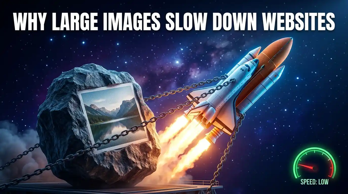
Large images are one of the leading causes of slow website performance, poor user experience, and declining search engine rankings. When unoptimized images are uploaded to a website, they increase page weight, multiply HTTP requests, delay rendering pipelines, and push key Core Web Vitals metrics — especially Largest Contentful Paint — beyond acceptable thresholds. This guide explores the technical mechanics behind why large images slow down websites, how they affect SEO, bounce rates, and conversions, and what actionable steps webmasters, developers, and content creators can take to optimize image delivery without sacrificing visual quality.
Table of Contents
- Understanding Website Load Speed and Image Weight
- The Science Behind Image File Size and Web Performance
- How Large Images Affect Core Web Vitals
- The Cascading Effects of Slow Image Load Times
- Image Formats and Their Role in File Size
- HTTP Requests, Bandwidth, and Server Load
- Lazy Loading, Responsive Images, and Smart Delivery
- Practical Solutions to Fix Large Image Problems
- Tools and Metrics to Audit Image Performance
- Frequently Asked Questions
- Conclusion
Understanding Website Load Speed and Image Weight
What Is Page Load Time?
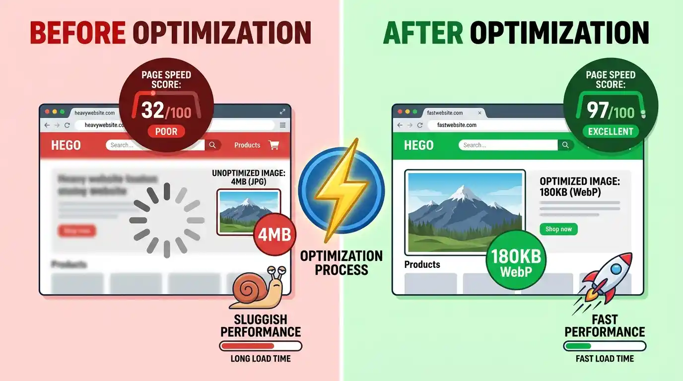
Page load time refers to the total duration it takes for a web browser to fully download and render all elements of a webpage — including HTML structure, CSS stylesheets, JavaScript files, fonts, and, most critically, images. According to Google’s performance research, 53% of mobile users abandon a page that takes more than 3 seconds to load, making speed not just a technical metric but a direct revenue concern.
Page weight — the total size of all assets on a page — is one of the most reliable predictors of slow load times. And within that page weight, images consistently represent the largest single contributor, often accounting for 50%–80% of total page size on media-rich sites.
How Browser Rendering Works
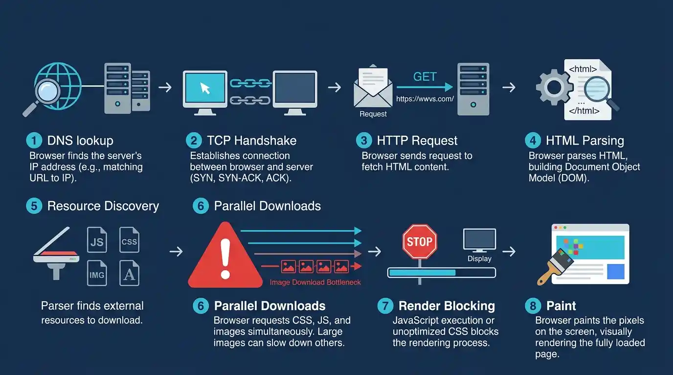
When a user types a URL and hits Enter, a complex chain of events unfolds:
- DNS Lookup — The browser resolves the domain to an IP address.
- TCP Handshake — A connection is established with the server.
- HTTP/HTTPS Request — The browser requests the HTML document.
- HTML Parsing — The browser reads the HTML and begins building the DOM (Document Object Model).
- Resource Discovery — As it parses, it discovers linked CSS, JS, and image files.
- Parallel Downloads — The browser initiates downloads for each discovered resource.
- Render Blocking — Critical CSS and JS may block rendering until fully loaded.
- Paint — The browser paints pixels on screen.
Images enter at step 5. The larger each image file, the longer step 6 takes. If a hero image at the top of the page is 4MB, it delays the “paint” of the most visible part of your site by seconds — a catastrophic experience on slow mobile connections.
Where Images Fit in the Loading Pipeline
Images are non-blocking resources by default, meaning they don’t prevent the initial HTML and CSS from rendering. However, this nuance is often misunderstood. A large image in the viewport (the visible screen area) directly delays Largest Contentful Paint (LCP), which Google uses as a Core Web Vitals metric. Even “non-blocking” images that are enormous in file size consume precious bandwidth that slows the download of every other resource on the page simultaneously.
The Science Behind Image File Size and Web Performance
Pixel Dimensions vs. File Size — What’s the Difference?
Many site owners confuse pixel dimensions with file size. A common mistake: uploading a 5000×3000 pixel image because “it looks better.” In reality, most website content areas are never wider than 1200–1400px. A 5000px-wide image displayed at 800px still forces the browser to download the entire 5000px file — wasting bandwidth proportional to the unnecessary pixel data.
- Pixel dimensions determine how large the image appears in the layout.
- File size (in KB or MB) determines how much data must be transferred over the network.
- A 5000×3000 JPEG can easily be 8–12MB. The same image resized to 1200×720 might be just 120–200KB — a 50x reduction with no perceptible visual difference in a browser.
Image Resolution and Its Impact on Load Time
Resolution (measured in PPI — pixels per inch) matters for print, not screens. Web browsers render images based on pixel dimensions, not PPI. A 300 PPI image exported from Photoshop carries metadata that inflates the file size but does absolutely nothing to improve how it looks on screen. Always export images at 72–96 PPI for web use.
Compression Types: Lossy vs. Lossless
Image compression is the process of reducing file size by encoding image data more efficiently.
- Lossy compression discards some image data permanently. JPEG uses lossy compression. At quality settings of 75–85%, the human eye cannot detect the difference, but the file size can shrink by 60–80%.
- Lossless compression reduces file size without discarding any data — PNG uses this approach. While preserving perfect quality, lossless files are usually significantly larger than their lossy equivalents.
- Perceptual compression — used by modern formats like WebP and AVIF — applies psychovisual models to discard data in ways the human visual system is least likely to notice, achieving far better size-to-quality ratios.
You can Compress Images Without Losing Quality using smart compression tools that apply perceptual algorithms without degrading visual fidelity.
How Large Images Affect Core Web Vitals
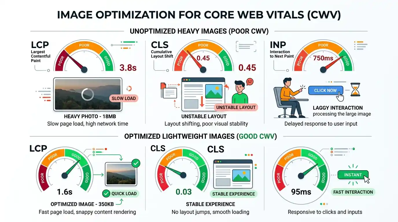
Google’s Core Web Vitals are a set of standardized performance metrics used to evaluate real-world user experience. Large images impact all three primary metrics.
Largest Contentful Paint (LCP)
LCP measures how long it takes for the largest visible element in the viewport to fully render. In most cases, that element is a hero image, banner, or featured photo. Google’s benchmark for a good LCP is under 2.5 seconds.
A 3MB hero image on a 10 Mbps connection takes approximately 2.4 seconds to download — before any other rendering work happens. On a 4G mobile connection averaging 4–5 Mbps, that same image takes 5–6 seconds, immediately failing the LCP threshold and triggering poor Core Web Vitals scores.
Cumulative Layout Shift (CLS)
CLS measures visual stability — how much the page layout shifts unexpectedly during loading. When images load without specified width and height attributes, the browser doesn’t reserve space for them. As each image loads, it pushes content down, causing jarring layout shifts that frustrate users and increase CLS scores. Large images, taking longer to load, extend the window during which these shifts can occur.
First Input Delay (FID) and Interaction to Next Paint (INP)
While images don’t directly block JavaScript execution, the bandwidth consumed by massive images reduces the resources available for script downloads. Slower script loading means users interact with a partially-initialized page, increasing FID (now succeeded by INP in 2024). Poor INP scores signal sluggish interactivity — a direct consequence of bandwidth saturation caused by oversized images.
The Cascading Effects of Slow Image Load Times
SEO Rankings and Google’s Page Experience Signal
Google’s Page Experience update formally incorporated Core Web Vitals as ranking signals. Sites with poor LCP, CLS, and INP scores — largely caused by unoptimized images — face direct ranking penalties in competitive search results. According to research published by Backlinko, page speed is a confirmed ranking factor across both mobile and desktop results, with faster pages receiving a measurable ranking advantage.
Additionally, Google’s crawler (Googlebot) has a crawl budget — a finite number of requests it will make to your site in a given timeframe. Pages bloated with large images are crawled more slowly and less completely, meaning new content may be discovered and indexed more slowly, further harming organic visibility.
Bounce Rate and User Experience
Bounce rate — the percentage of visitors who leave after viewing only one page — is directly correlated with load speed. Research consistently shows:
- Pages loading in 1–3 seconds have a bounce rate of around 32%.
- Pages loading in 5 seconds, see bounce rates climb to over 90%.
A user who abandons your site because a giant image took 8 seconds to load is a lost opportunity that no amount of great content or excellent copy can recover.
Conversion Rate Loss
For e-commerce sites, the financial stakes are immediate. Every 100ms of additional load time can reduce conversions by 1%. Product image galleries packed with unoptimized, high-resolution JPEGs can add multiple seconds to product page load times — directly suppressing add-to-cart actions and checkout completions.
Mobile Performance Degradation
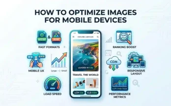
Mobile users frequently operate on variable, congested networks — 3G in rural areas, crowded 4G at events, or weak Wi-Fi. A page that loads adequately on a fiber connection can be virtually unusable on mobile if it’s carrying 15MB of unoptimized images. Mobile-first indexing means Google evaluates your mobile experience for rankings — making mobile image optimization a direct SEO imperative, not just a UX nicety.
Image Formats and Their Role in File Size
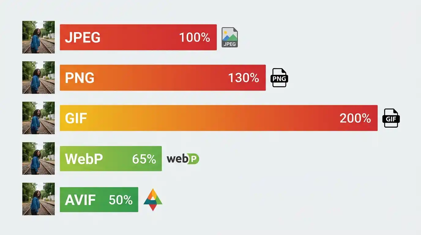
JPEG, PNG, GIF — The Legacy Formats
- JPEG (.jpg): Best for photographs and complex color gradients. Uses lossy compression. Does not support transparency. Still widely used but outdated compared to modern alternatives.
- PNG (.png): Supports transparency (alpha channel). Uses lossless compression. Ideal for logos, icons, and graphics with flat colors, but produces much larger files than JPEG for photographs.
- GIF (.gif): Limited to 256 colors. Used for simple animations. Dramatically inferior to modern formats — a 2MB GIF can often be replaced by a 200KB WebP animation.
WebP — The Modern Standard
WebP, developed by Google, provides 25–35% smaller file sizes than JPEG at equivalent visual quality, while also supporting transparency (unlike JPEG) and animation (unlike JPEG and PNG). Browser support is now universal across Chrome, Firefox, Safari, and Edge. There is virtually no reason to serve JPEG or PNG images when WebP is available.
You can Convert JPG to WebP Online Free using modern conversion tools that batch-process your entire image library with a single upload.
AVIF and the Future of Image Compression
AVIF (AV1 Image File Format) is the next-generation image format offering 50% smaller files than JPEG and 20% smaller than WebP, with superior color depth and HDR support. Browser support is growing rapidly. Forward-thinking developers implement AVIF with WebP as a fallback using the HTML <picture> element:
html
<picture>

  <source srcset="image.avif" type="image/avif">

  <source srcset="image.webp" type="image/webp">

  <img src="image.jpg" alt="Description">

</picture>
HTTP Requests, Bandwidth, and Server Load
How Each Image Triggers an HTTP Request
Every image on a page requires a separate HTTP request to the server. A page with 20 unoptimized images generates 20 separate requests. Even with HTTP/2 multiplexing (which allows parallel requests over a single connection), the cumulative data transferred still saturates bandwidth when each image is oversized. Fewer, smaller images mean fewer and faster requests — a principle called request budget management.
Bandwidth Consumption and Hosting Costs
Beyond user experience, large images have direct financial costs. Shared hosting plans and cloud services charge based on the bandwidth consumed. A high-traffic site serving 4MB images instead of 400KB WebP equivalents consumes 10x more bandwidth — translating to significantly higher hosting bills and CDN delivery costs at scale.
CDN vs. Direct Server Delivery
A Content Delivery Network (CDN) distributes your assets across geographically dispersed edge servers, reducing latency by serving images from a location physically closer to the user. However, a CDN does not reduce file size — it only reduces the distance data travels. A 5MB image delivered via CDN is still a 5MB image. Optimal performance requires both format/compression optimization and CDN delivery.
Lazy Loading, Responsive Images, and Smart Delivery
What Is Lazy Loading?
Lazy loading defers the loading of images that are below the viewport (not immediately visible) until the user scrolls toward them. Instead of loading 40 product images on a category page all at once, the browser initially loads only the first 6–8 visible images, then loads others on demand.
Implementation is now trivially simple in HTML5:
<img src="product.webp" loading="lazy" alt="Product name">
This single attribute can dramatically reduce initial page weight on image-heavy pages.
srcset and sizes — Serving the Right Image to the Right Device
Responsive images allow you to specify multiple versions of an image at different sizes, letting the browser select the most appropriate one based on the user’s screen and viewport:
<img

  src="hero-800.webp"

  srcset="hero-400.webp 400w, hero-800.webp 800w, hero-1200.webp 1200w"

  sizes="(max-width: 600px) 400px, (max-width: 900px) 800px, 1200px"

  alt="Hero image">
A mobile user with a 375px screen receives the 400px version — drastically reducing their data consumption compared to receiving the full 1200px image.
Image CDNs and On-the-Fly Optimization
Services like Cloudinary, Imgix, and Fastly Image Optimizer provide on-the-fly image transformation — automatically resizing, reformatting, and compressing images based on the requesting device’s capabilities. These platforms detect WebP/AVIF support, screen dimensions, and network speed, delivering the optimal image variant without any manual effort from the developer.
Practical Solutions to Fix Large Image Problems
Resize Before You Upload
Never upload images at their native camera resolution. Before uploading any image to your CMS:
- Determine the maximum display width for that image (e.g., 1200px for a blog hero).
- Resize the image to that width using tools like Photoshop, GIMP, Squoosh, or Sharp.
- Never upload 4000px images for content areas that display at 800px.
Choose the Right File Format
| Use Case | Recommended Format |
| Photographs | WebP (or AVIF with fallback) |
| Logos / Icons | SVG or WebP |
| Transparent Graphics | WebP (PNG as fallback) |
| Animations | WebP (or CSS animations) |
Use Compression Tools
Apply compression after resizing. Tools like Squoosh (browser-based), ShortPixel (WordPress plugin), and TinyPNG offer significant size reduction. Target file sizes:
- Hero/banner images: Under 200KB
- Blog inline images: Under 100KB
- Thumbnails: Under 30KB
Implement Caching Headers
Configure your server to send Cache-Control headers for images, instructing browsers to store them locally after the first visit. Returning visitors load cached images instantly — zero network cost on repeat views. A typical configuration:
Cache-Control: public, max-age=31536000, immutable
Tools and Metrics to Audit Image Performance
Google PageSpeed Insights
PageSpeed Insights (pagespeed.web.dev) analyzes any URL and reports specific image issues, including:
- “Properly size images” — flags images larger than needed for their display size.
- “Serve images in next-gen formats” — recommends WebP/AVIF conversions.
- “Efficiently encode images” — identifies images that can be further compressed.
GTmetrix and WebPageTest
GTmetrix provides a waterfall chart showing every resource load time, making it easy to identify which specific images are bottlenecks. WebPageTest offers filmstrip views showing exactly what users see second-by-second during page load — invaluable for understanding the visual impact of slow-loading images.
Lighthouse Image Audit
Chrome DevTools includes Lighthouse, which performs a comprehensive image audit including opportunity estimates showing exactly how many seconds (and kilobytes) you can save by optimizing each image. Run it via DevTools → Lighthouse → Performance.
Frequently Asked Questions
Q: What is the ideal image file size for websites? A: General best practice targets hero images under 200KB, inline blog images under 100KB, and thumbnails under 30KB. These are guidelines — context matters, but staying under these thresholds keeps page weight manageable.
Q: Does image size affect SEO directly? A: Yes. Google uses LCP (heavily influenced by image load time) as a Core Web Vitals ranking signal. Slow-loading images = poor LCP = ranking disadvantage.
Q: Is WebP really better than JPEG? A: For the vast majority of use cases, yes. WebP delivers equivalent visual quality at 25–35% smaller file sizes with universal modern browser support.
Q: Do large images hurt mobile more than desktop? A: Significantly. Mobile devices typically have slower connections, smaller CPU resources, and Google uses mobile performance for indexing — making mobile image optimization doubly critical.
Q: Can I use lazy loading for all images? A: Use loading=”eager” (or no attribute) for above-the-fold images like hero banners — lazy loading them actually delays LCP. Apply loading=”lazy” to all images below the fold.
Conclusion
Large, unoptimized images represent one of the most prevalent and solvable performance problems on the modern web. They inflate page weight, delay Core Web Vitals, suppress SEO rankings, frustrate users, and cost money in bandwidth. The solutions are well-established: resize images to their display dimensions, convert to WebP or AVIF, apply intelligent compression, implement lazy loading, use responsive image markup, and audit regularly with Lighthouse or PageSpeed Insights. Every kilobyte you eliminate from your images is a direct investment in faster load times, better rankings, lower bounce rates, and higher conversions.
