Summary
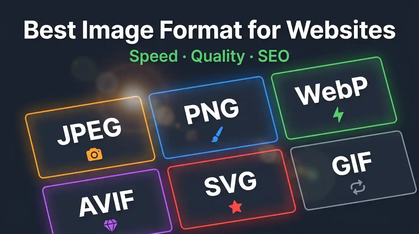
Choosing the best image format for websites is one of the most impactful decisions you can make for web performance, user experience, and SEO. This guide covers every major web image format — JPEG, PNG, WebP, AVIF, SVG, GIF, and more — comparing their compression efficiency, visual quality, browser support, and ideal use cases. Whether you are optimizing a photography portfolio, an e-commerce store, or a corporate blog, understanding image formats helps you serve smaller, faster, and higher-quality visuals to every user. The modern recommendation leans toward WebP and AVIF for raster images, SVG for vector graphics, and strategic use of JPEG and PNG as fallbacks — all implemented with responsive image techniques and lazy loading for maximum Core Web Vitals performance.
Table of Contents
What Are Web Image Formats and Why Do They Matter?
- The Role of Image Formats in Web Performance
- How Browsers Render Images
Overview of All Major Image Formats for the Web
- JPEG (JPG) — The Universal Standard
- PNG — Lossless Quality with Transparency
- WebP — The Modern Web Format
- AVIF — The Next-Generation Contender
- SVG — Scalable Vector Graphics
- GIF — Animated but Outdated
- HEIC/HEIF — Mobile-First but Limited
- TIFF — Print Quality, Not Web-Ready
Comparing Image Formats: Quality, Compression & File Size
- Lossy vs. Lossless Compression Explained
- Format Comparison Table
- Visual Quality vs. Performance Trade-offs
Best Image Format by Use Case
- Best Format for Photographs and Hero Images
- Best Format for Logos and Icons
- Best Format for Illustrations and Animations
- Best Format for E-commerce Product Images
- Best Format for Blog Thumbnails and Social Sharing
Browser Compatibility and Support
- WebP Browser Support in 2026
- AVIF Browser Support and Fallbacks
- Using the <picture> Element for Format Fallbacks
Image Optimization Best Practices
- Choosing the Right Compression Level
- Responsive Images and srcset
- Lazy Loading for Faster Page Load
- Image CDNs and Automatic Format Delivery
Impact of Image Formats on Core Web Vitals and SEO
- Largest Contentful Paint (LCP) and Images
- Cumulative Layout Shift (CLS) and Aspect Ratios
- How Google Evaluates Image Optimization
Tools for Converting and Optimizing Web Images
- Online Converters
- Command-Line Tools (ImageMagick, cwebp, avifenc)
- CMS and Plugin Solutions
Frequently Asked Questions
What Are Web Image Formats and Why Do They Matter?
Every image on a website exists in a specific file format that determines how pixel data is stored, compressed, and decoded. The image format you choose directly controls three critical factors: file size, visual fidelity, and rendering speed. These three factors cascade into broader consequences — your page load time, bounce rate, search engine ranking, and bandwidth costs all hinge on this single technical decision.
According to the HTTP Archive, images account for more than 50% of the average webpage’s total bytes. Optimizing image formats is, therefore, not a minor tweak — it is the single highest-leverage action a web developer or content creator can take to improve site performance.
The Role of Image Formats in Web Performance
A heavy, poorly-formatted image triggers a chain of performance penalties. The browser must download more bytes, decode a larger file, and paint more pixels — all of which delay the Largest Contentful Paint (LCP), a Core Web Vital that Google uses directly as a ranking signal. Switching from a standard JPEG to a modern WebP or AVIF format can reduce file sizes by 25–50% with no visible quality loss, directly accelerating load times.
How Browsers Render Images
When a browser encounters an <img> tag, it sends an HTTP request for the image file, receives compressed binary data, decodes it into a pixel bitmap, and paints it to the screen. Different formats require different decoding algorithms — some (like SVG) are vector-based and resolution-independent, while others (JPEG, PNG, WebP) are raster-based and resolution-dependent. Understanding this distinction shapes every format decision you make.
Overview of All Major Image Formats for the Web
JPEG (JPG) — The Universal Standard
JPEG (Joint Photographic Experts Group) has been the dominant web image format since the early 1990s. It uses lossy compression, meaning some image data is permanently discarded to achieve smaller file sizes. This trade-off works extremely well for photographs and complex imagery with gradients, where minor pixel-level degradation is invisible to the human eye.
Key characteristics:
- Lossy compression with adjustable quality (1–100)
- No transparency support (no alpha channel)
- Excellent browser support — universally compatible
- Best for: photographs, hero images, complex real-world scenes
- Typical file size: moderate; quality-80 JPEG is the industry standard baseline
If you work with JPEG images and need to convert them for web use, tools like the JPG → PNG Converter let you switch formats quickly while preserving image quality.
PNG — Lossless Quality with Transparency
PNG (Portable Network Graphics) uses lossless compression, meaning every pixel is preserved exactly. This makes it the preferred format for graphics that require pixel-perfect accuracy — logos, icons, UI elements, screenshots, and any image with a transparent background.
Key characteristics:
- Lossless compression; no quality degradation
- Full alpha channel transparency support
- Larger file sizes than JPEG for photographic content
- Two variants: PNG-8 (256 colors) and PNG-24 (16.7 million colors)
- Best for: logos, icons, text-heavy graphics, images requiring transparency
PNG’s weakness is file size. A photograph saved as PNG can be 5–10× larger than the same image saved as JPEG, making PNG a poor choice for photographic web content.
WebP — The Modern Web Format
Developed by Google and released in 2010, WebP has become the recommended modern web image format for most use cases. It supports both lossy and lossless compression, as well as transparency and animation — essentially combining the strengths of JPEG, PNG, and GIF in a single format.
To understand the full technical background and capabilities of this format, read this detailed explainer on What Is WebP Format.
Key characteristics:
- 25–34% smaller than JPEG at equivalent quality (lossy mode)
- 26% smaller than PNG (lossless mode)
- Supports transparency (alpha channel)
- Supports animation
- Browser support: 97%+ globally as of 2026
- Best for: photographs, UI graphics, icons, animated content
WebP is now the de facto recommendation for most web image use cases, supported by all major browsers, including Chrome, Firefox, Safari, and Edge.
AVIF — The Next-Generation Contender
AVIF (AV1 Image File Format) is derived from the AV1 video codec and represents the current frontier of web image compression. It offers dramatically better compression than both JPEG and WebP, often achieving 50% smaller file sizes than JPEG at equivalent or superior quality.
Key characteristics:
- Superior compression efficiency — best-in-class for file size
- Supports HDR (High Dynamic Range) and wide color gamut
- Supports transparency and animation
- Slower encoding than WebP
- Browser support: ~92% globally as of 2026 (not supported in older Safari versions)
- Best for: high-quality hero images, e-commerce product photos, photography sites
AVIF is the future, but its encoding complexity and slightly less-universal browser support mean WebP remains the pragmatic default for most production deployments today.
SVG — Scalable Vector Graphics
SVG (Scalable Vector Graphics) is fundamentally different from all raster formats. It is an XML-based vector format, meaning images are described mathematically as shapes, paths, and coordinates rather than as grids of pixels. SVG files scale infinitely without any quality loss.
Key characteristics:
- Resolution-independent — perfect at any screen size
- Extremely small file sizes for simple graphics
- Supports interactivity and CSS animation
- Can be inlined directly into HTML
- Not suitable for photographs or complex imagery
- Best for: logos, icons, illustrations, infographics, UI elements
SVG is the unambiguous best format for logos and icons on the web. A company logo served as SVG will be crisp on a 4K display and still weigh under 10KB.
GIF — Animated but Outdated
GIF (Graphics Interchange Format) is one of the oldest web formats, dating to 1987. Its defining feature — animation support — made it the format of choice for simple animated web content for decades. However, GIF is severely limited: it supports only 256 colors and produces enormous file sizes compared to modern animated formats.
Key characteristics:
- Limited to 256 colors per frame
- Supports animation (looping)
- Lossless compression but poor efficiency
- Large file sizes vs. animated WebP or video formats
- Best for: legacy support; otherwise, replace with animated WebP or MP4
Modern best practice is to replace GIF with animated WebP or short MP4/WebM videos, which can be 80–95% smaller for equivalent animated content.
HEIC/HEIF — Mobile-First but Limited
HEIC (High Efficiency Image Container) is Apple’s default camera format for iPhone photos. While it achieves excellent compression, browser support on the web is minimal and it should not be used as a primary web format. Always convert HEIC images to WebP, AVIF, or JPEG before publishing.
TIFF — Print Quality, Not Web-Ready
TIFF (Tagged Image File Format) is a professional archival and print format that preserves maximum image data. TIFF files are enormous (often 50–200MB) and have no meaningful browser support. Never use TIFF for web publishing.
Comparing Image Formats: Quality, Compression & File Size
Lossy vs. Lossless Compression Explained
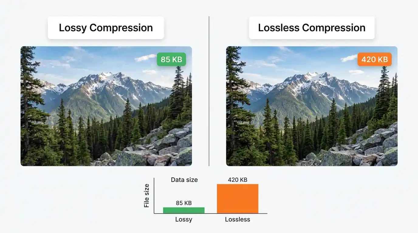
Lossy compression permanently removes image data that the human visual system is unlikely to notice — high-frequency details in uniform areas, subtle color transitions. JPEG, lossy WebP, and lossy AVIF use this approach, achieving dramatic file size reductions (50–90%) with minimal perceptible quality impact.
Lossless compression uses mathematical encoding to represent pixel data more efficiently without discarding anything. PNG, lossless WebP, and lossless AVIF use this approach, guaranteeing pixel-perfect fidelity at the cost of larger files.
Format Comparison Overview
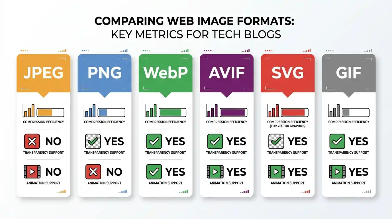
| Format | Compression | Transparency | Animation | Relative File Size | Browser Support |
| JPEG | Lossy | ✗ | ✗ | Baseline | 100% |
| PNG | Lossless | ✓ | ✗ | Large | 100% |
| WebP | Both | ✓ | ✓ | 25–34% smaller than JPEG | ~97% |
| AVIF | Both | ✓ | ✓ | 40–50% smaller than JPEG | ~92% |
| SVG | Vector | ✓ | ✓ | Tiny (for vectors) | 100% |
| GIF | Lossless | Partial | ✓ | Very Large | 100% |
Visual Quality vs. Performance Trade-offs
The key NLP concept here is perceptual quality — the goal is not pixel-perfect accuracy but the threshold at which the human eye cannot distinguish the compressed image from the original. For photographic content, JPEG at quality 80, WebP at quality 75, or AVIF at quality 60 all typically hit this perceptual threshold while achieving excellent compression.
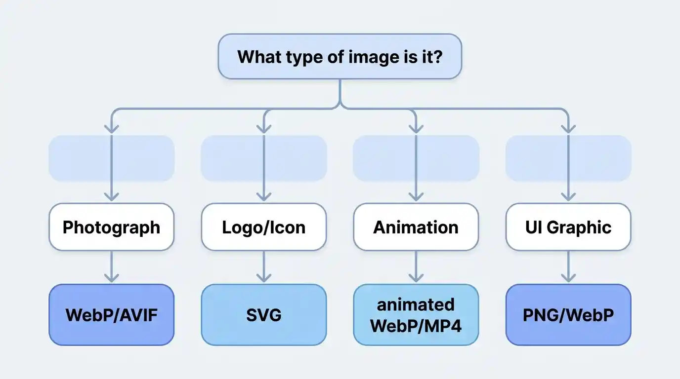
Best Image Format by Use Case
Best Format for Photographs and Hero Images
Recommendation: AVIF first → WebP fallback → JPEG fallback
For full-width hero images, product photography, and editorial photographs, use AVIF for browsers that support it, WebP for broad modern browser coverage, and JPEG as the universal fallback. Implement this using the HTML <picture> element with <source> tags.
Best Format for Logos and Icons
Recommendation: SVG
Always serve logos and icons as SVG. They are infinitely scalable, typically tiny in file size, and can be animated or styled with CSS. For raster-only scenarios (e.g., email clients), use PNG-24.
Best Format for Illustrations and Animations
Recommendation: SVG (static illustrations) / Animated WebP or MP4 (animations)
Flat illustrations and icon sets should be SVG. For animated graphics, animated WebP outperforms GIF in every measurable way. For complex animations, a short, muted <video> with MP4/WebM source is often the most efficient approach.
Best Format for E-commerce Product Images
Recommendation: WebP with AVIF for high-priority images, PNG for transparent product cutouts
Product images need to convey precise detail and texture. Use WebP (or AVIF for hero product images) for photography, and PNG-24 or WebP with alpha for product cutout images on white or transparent backgrounds.
Best Format for Blog Thumbnails and Social Sharing
Recommendation: WebP with JPEG fallback
Blog thumbnails need fast loading and reasonable quality. WebP delivers both. Note that social media platforms (Facebook, Twitter/X, LinkedIn) do not reliably support WebP in Open Graph previews — always generate a JPEG version for your og:image meta tag.
Browser Compatibility and Support
WebP Browser Support in 2026
WebP is supported by all major browsers as of 2026, including Chrome, Firefox, Safari (since version 14), Edge, and Opera. Global support exceeds 97%, making WebP safe to use as a primary format with JPEG as a legacy fallback for the small percentage of users on very old browsers.
AVIF Browser Support and Fallbacks
AVIF support has expanded significantly, covering Chrome, Firefox, Safari 16+, and Edge. However, older Safari versions and some mobile browsers still lack support. Always provide a WebP or JPEG fallback when using AVIF.
Using the <picture> Element for Format Fallbacks
The <picture> element is the standard HTML mechanism for serving different formats based on browser support:
<picture>

  <source srcset="hero.avif" type="image/avif">

  <source srcset="hero.webp" type="image/webp">

  <img src="hero.jpg" alt="Hero image description" width="1200" height="600">

</picture>
The browser selects the first <source> it supports and ignores the rest. The <img> tag serves as the universal fallback.
Image Optimization Best Practices
Choosing the Right Compression Level
For JPEG and lossy WebP, quality settings between 75–85 represent the optimal perceptual quality-to-file-size ratio for most photographic content. Below 70, compression artifacts become visible. Above 90, the file size increases substantially with negligible visible improvement.
Responsive Images and srcset
Serving a 2400px-wide image to a 375px mobile screen wastes bandwidth and slows load time. The srcset and sizes attributes allow browsers to select the appropriately-sized image for their viewport:
<img

  src="image-800.webp"

  srcset="image-400.webp 400w, image-800.webp 800w, image-1600.webp 1600w"

  sizes="(max-width: 600px) 400px, (max-width: 1200px) 800px, 1600px"

  alt="Descriptive alt text"

>
Lazy Loading for Faster Page Load
Images below the fold do not need to load immediately. The native loading=”lazy” attribute defers off-screen images until the user scrolls near them:
<img src="image.webp" loading="lazy" alt="Description" width="800" height="600">
Always specify explicit width and height attributes to prevent Cumulative Layout Shift (CLS), another Core Web Vital metric.
Image CDNs and Automatic Format Delivery
Image CDNs like Cloudinary, Imgix, and Bunny.net automatically convert, resize, and serve images in the optimal format for each requesting browser. This eliminates manual format management and is the recommended approach for high-traffic sites. According to Web.dev’s image optimization guide, using a CDN for image delivery can reduce image payload by 40–70% without any manual format conversion.
Impact of Image Formats on Core Web Vitals and SEO
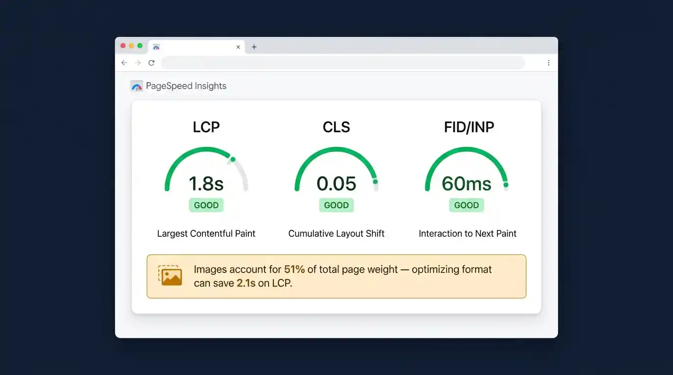
Largest Contentful Paint (LCP) and Images
LCP measures how long it takes for the largest visible element — often a hero image — to render. Google’s threshold for a “good” LCP is under 2.5 seconds. Heavy, unoptimized images are the primary cause of poor LCP scores. Switching to WebP or AVIF, combined with preloading the LCP image using <link rel=”preload”>, can dramatically improve this score.
Cumulative Layout Shift (CLS) and Aspect Ratios
CLS measures visual instability — elements jumping around as the page loads. Images without explicit dimensions cause CLS because the browser doesn’t reserve space until the image loads. Always define width and height on every <img> tag.
How Google Evaluates Image Optimization
Google’s PageSpeed Insights and Lighthouse audits explicitly flag opportunities to serve images in next-gen formats (WebP, AVIF), size images appropriately for their display container, and efficiently encode images. Passing these audits contributes to better Core Web Vitals scores, which are a confirmed ranking factor in Google Search. The Google Search Central documentation on image best practices recommends using descriptive filenames, meaningful alt text, and structured data alongside format optimization.
Tools for Converting and Optimizing Web Images
Online Converters
Browser-based tools like Squoosh (by Google) provide real-time before/after comparisons and support WebP, AVIF, MozJPEG, and PNG conversion. They are ideal for manual, one-off conversions.
Command-Line Tools
For batch processing and build pipeline integration:
- cwebp — Google’s official WebP encoder
- avifenc — AVIF encoding tool from the libavif library
- ImageMagick — Universal image processing with format conversion support,
- sharp (Node.js) — High-performance image processing library for server-side automation
CMS and Plugin Solutions
WordPress users can use plugins like ShortPixel, Smush, or Imagify to automatically convert uploaded images to WebP and serve them with appropriate fallbacks. Shopify, Wix, and Squarespace handle automatic WebP conversion natively.
Frequently Asked Questions
Q: Should I use WebP or AVIF in 2026? Use AVIF for maximum compression where browser support allows, with WebP as a fallback. For simpler deployments, WebP alone is an excellent modern choice.
Q: Is PNG or JPEG better for product images? Use JPEG (or WebP) for photographic product images, and PNG (or WebP with alpha) for product cutouts with transparent backgrounds.
Q: Does image format affect SEO directly? Indirectly but significantly. Image format affects page speed, which affects Core Web Vitals, which are a Google ranking factor. Faster-loading, optimized images also improve user experience and reduce bounce rates.
Q: Can I use SVG for all images? SVG is only suitable for vector graphics — logos, icons, illustrations, and diagrams. It cannot represent photographs.
Q: What format should I use for Open Graph images? Use JPEG for Open Graph (og:image) tags, as social media crawlers have inconsistent WebP support.
